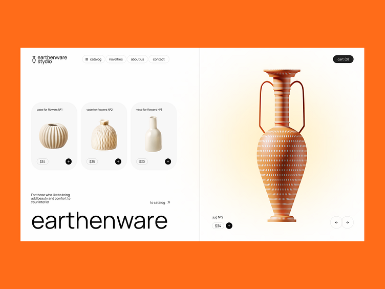
Earthenware shop Website
Minimalistic design concept of a Landing page website for a earthenware shop.
I decided to focus on the main thing and bring the product to the forefront. The first thing the user sees is the slider on the right, he will immediately become interested in “what else is there?” After all, one of the main tasks is to catch the attention of the person who entered the store for the first time.
My contacts:
More by Olga Abramova View profile
Like
