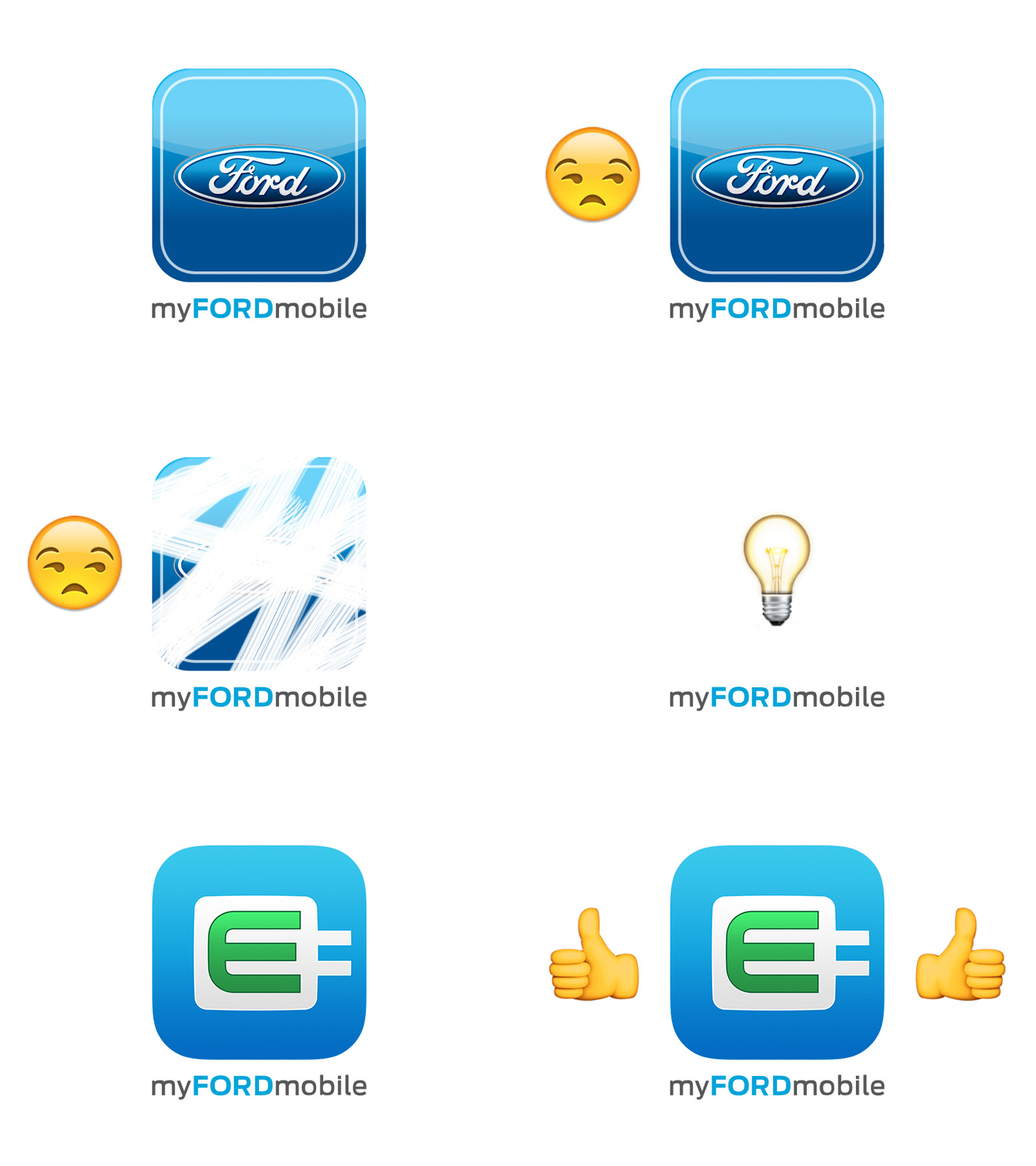
MyFord Mobile Icon
We just released a new update for MyFord Mobile which is Ford's application for remote controlling your Hybrid and Electric vehicles. Since one of the big additions is Android Wear and Apple Watch support (I'll put together some stuff soon), @ndavio51(https://dribbble.com/ndavio51) and I wanted to take the time to update the icon to something that reflected the target audience more (and just would look much cleaner).
We looked at using the Leaf+Road icon at first but that is also used across all our vehicles with Eco-Boost engines and could still cause some confusion on who this app was for. We didn't want an F-150 owner to mistake that symbol on their car with an application that doesn't apply to them.
There was a lot of discussion about including the Ford oval, but we decided since the name is directly below the icon in most cases or on the log in screen that we didn't need to include it. We also have a new Ford owner app that applies to all of our vehicles and that should really be the one to include it.
We still are working towards cleaning up some of the UI in the rest of the app, but we're pretty happy we got this thing out the door.
https://itunes.apple.com/us/app/myford-mobile/id599142823?mt=8
