DINN Brand Book
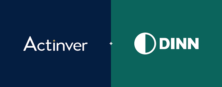
DINN wants to simplify the investment world and guide Mexicans to a better financial life. Combining the experience of a financial group (Actinver) with the simplicity of the digital world (DINN)
DINN wants to have a solid and simple brand that conveys closeness, and thus strengthens the relationship with its clients. DINN is your finance mentor and guide you to a better financial life.
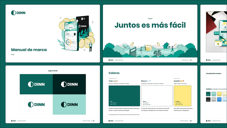
The manual is made up of 3 main blocks. I'll show you a little bit of the third, that's where the biggest visual change occurred.
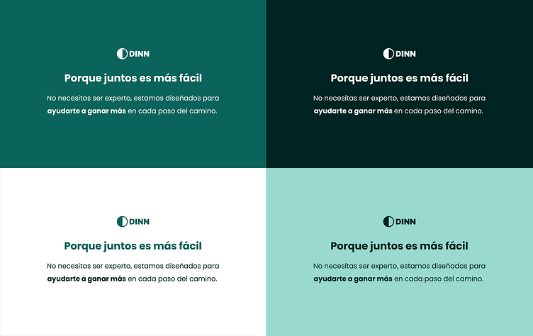
Color
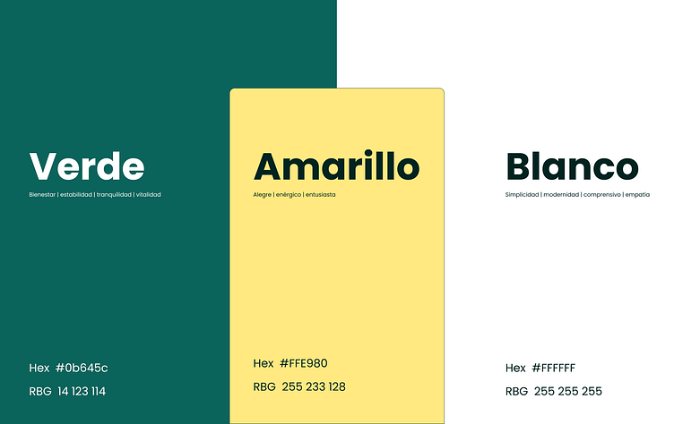
We seek balance in green tones with the aim of having a solid and simple brand and thus creating the best financial experience for our users.
The green color represents stability, harmony and well-being, at the same time it reflects our relaxing, guiding and listening personality.
The white works as our canvas and helps our ideas breathe.
And yellow as an accent, your benefit, you money, etc.
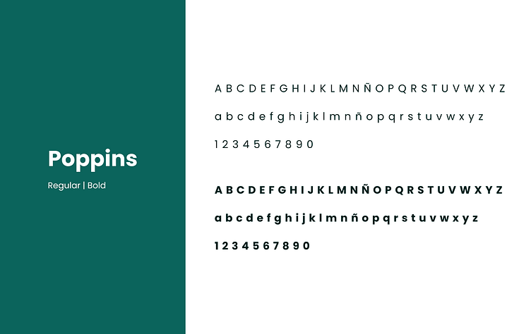
Typography
Poppins, a simple, friendly and accessible font. Perfect to transmit the support and stability that DINN provides.
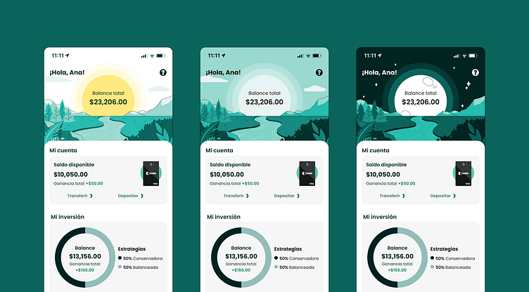
Illustrations
We illustrate complex concepts in a simpler and friendlier way. Our illustrations are mainly made up of the following 3 elements:
People
Nature
Coins
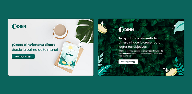
We want to convey the tranquility of a forest or the calm of a beach by the sea, the same thing you feel when you have your money in DINN


Photography
Real people in common places with authentic emotions.