History of Chronicle App Icon
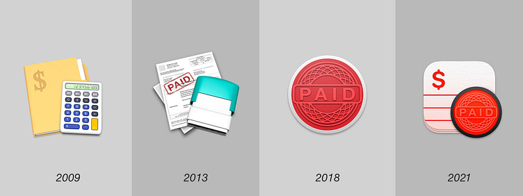
2009年のアイコンは限りある時間と予算の中で所持している素材で即興的に作ったものでした。製品が軌道に乗った2013年からは一貫してスタンプをメタファーに新たなデザインを展開しました。小さなアップデートを重ねる過程で主要な色は緑から一般的なインクの赤へ変化していきました。
In 2009, the icons were improvised with the materials we had on hand on a limited time and budget. Once the product took off in 2013, we consistently developed new designs using the stamp as a metaphor. Over the course of a series of small updates, the primary color changed from green to the more common ink red.
LittleFin Software: https://chronicleapp.com/