Furniture App Design Concept for Maestro
Description
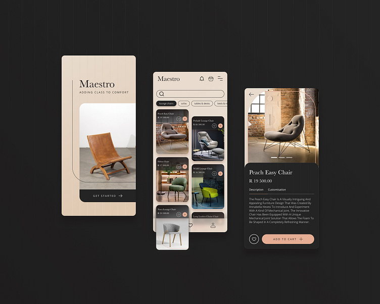
I designed this mobile app for Maestro, an online furniture brand specialising in minimalist furniture. The app features a clean, uncluttered design reflecting the brand's aesthetic. I used lines, shapes, textures, and composition to create a sense of elegance and sophistication. The pinstripe textures on the darker areas of the design add a touch of warmth and luxury.
Approach
I started by brainstorming ideas for the app's layout and design. I wanted to create an app that was easy to use and navigate, while still being visually appealing. I decided to use a minimalist design that would focus on the furniture itself. I used lines and shapes to create a sense of order and balance, and I used textures to add depth and interest.
Target Audience
The target audience for this app is people who are interested in minimalist furniture. The app is designed to be easy to use and navigate so that people can easily find the furniture they are looking for. The minimalist design is also appealing to people who appreciate simple and uncluttered design.


