Light vs. Dark Sidebar
Hi Dribbblers!
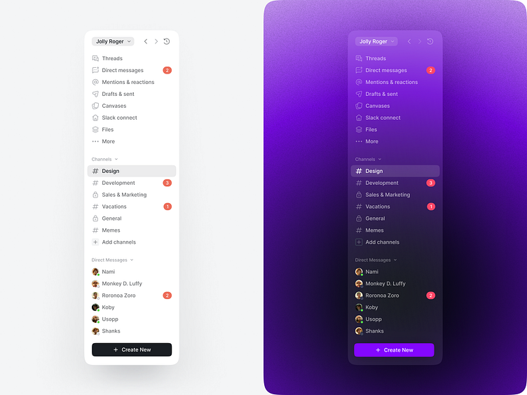
I would like to present the concept for a light and dark theme for the chat sidebar. The color palette for the light design consists of a combination of white, grey, and black, creating a minimalistic and clean view.
On the other hand, for the dark theme, I have used black and purple shades, contrasting the design with some blur and gradient, creating a fresh look.
Thanks for watching! 🫶
Would you like to collaborate with me?
Drop me a line: nastia.kazachenko@gmail.com