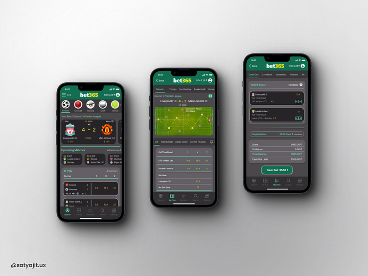
Bet365 Redesigned
Hello everyone, 👋
In my role as a user experience designer, I've taken a fresh approach to redesigning the screens of the Bet365 betting app to better align with user preferences and needs. Firstly, the new layout has been streamlined and simplified, providing users with a more intuitive and user-friendly navigation experience. This redesign focuses on decluttering the interface, ensuring that users can effortlessly access the features they use most frequently.
In terms of aesthetics, I've opted for a refreshed color scheme and typography that exude a more visually appealing and harmonious look. The new color palette is both inviting and easy on the eyes, while the typography enhances readability, enhancing the overall user experience.
The menu structure has been reorganized to improve the findability of specific betting options and information. I've employed a logical and user-centric approach, ensuring that users can swiftly locate events, odds and their betting history without unnecessary hassle.
Personalization features have been brought to the forefront in this redesign. Users will notice a renewed emphasis on tailoring the app to their individual preferences and betting history, creating a more engaging and personalized experience.
Furthermore, I've focused on optimizing the app's responsiveness and fluidity, making navigation smoother and more intuitive. This enhances the overall usability of the Bet365 betting app, resulting in a more enjoyable user experience.
My redesign of the Bet365 betting app has centered on user-centric principles, with a streamlined layout, improved aesthetics, enhanced findability, personalized features and a responsive interface, all aimed at providing users with an exceptional and enjoyable betting experience.
I'm really grateful for your careful review of my designs. Your feedback and encouragement inspire me to keep improving my skills and creating even more innovative work.


