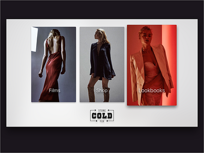
Shopping on tvOS
I don't have any feel at all for what customers will like and find easy to use, but I have a feeling that this layout will be more familiar for anybody who's used an Apple TV than the last designed I shared.
I like the full-bleed image and notion of space and light in the last one, but I'm not sold on the three buttons on the side. It feels a little sparse and less beautiful. It could work, sure, but maybe it doesn't fall in line with Apple's tvOS Human Interface Guidelines like this design does.
Here, each content category is presented equally in a familiar format and the imagery speaks for itself. This feels like a more natural fit for the TV, if only because the items that are meant to be interacted with, each large frame here, will stay large as someone walks away from their TV. In the last design, walking back into a kitchen for example might do the trick and make the three buttons on the left too small to read.
This campaign pictured above was worn by Brooke Perry and photographed by the incredible Harper Smith for Stone Cold Fox.

