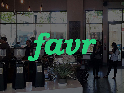
favr Brand Refresh
We wanted to create clear separation from the competition in favr's word mark. We refined the letter forms and went with a color that was more fun, energetic, and friendly, and moved away from their more 'enterprise' feeling color palette.
More by Cosmic View profile
Like

