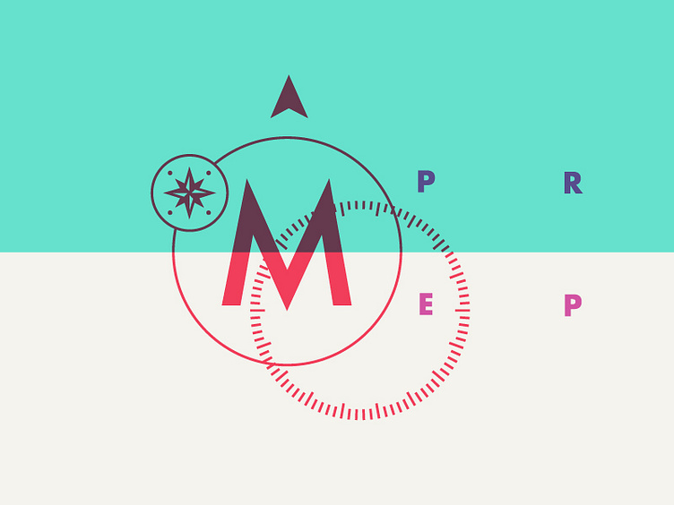
Deconstructed Direction
The client wanted to take this logo in a new direction, something that had more of a compass feeling to it. I wanted to make a mark that didn't have the typical compass feel to it. I stumbled upon this jumble by accident on my pasteboard and I felt like it was perfect. It's for a tutoring company so I was really drawn to the idea of you having all the pieces to succeed within yourself. You may just need some direction as to how to put those pieces together and move forward.
More by Mike Smith View profile
Like

