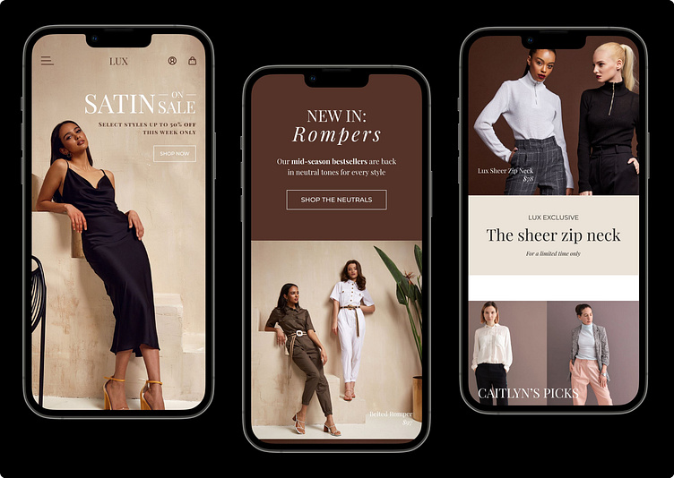
Fashion E-commerce Responsive Site Design
I recently designed a responsive site for imagined fashion label, Lux.
The goal of the design is to bring an easy shopping experience to users regardless of device, while portraying an upscale-yet-approachable brand identity.
Responsive Experience
The site design fluidly adapts to different screen sizes, while keeping the look and feel consistent across different viewports.
Full desktop and mobile designs are shown below:
Unique Challenge
A major current trend on women's e-commerce sites features white text over lighter backgrounds and images.
Since this trend isn't very accessible to users with vision impairments, I needed to find a way to incorporate this trend while also keeping important aspects of the design accessible.
To do this, I implemented the white text trend with secondary information that would normally be hidden or not present on this area of the site (flavor text, off-hand pricing), while keeping important user-focused content (navigation, CTAs, shipping info) adhering to WCAG AA standards.
This makes the lighter text more of a visual design element rather than a focal or informational point, while still making it available to screenreaders and users-at-large.


