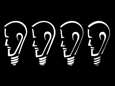
Which version works best?
Last spring I made a personal logo - something for me to letterpress (or laser cut) onto business cards should I decide to freelance.
I blended the most recognizable aspects of a lightbulb, a face, and an ear, and drew inspiration from Rodin's "The Thinker" for the slight downward tilt and furrowed brow in the facial expression.
As with all of my logo and icon design work, I've attached a process video of how I decided on the shapes for this piece.
design_by_ajay_rough_sketches.mp4
500 KB
More by Ajay Ganapathy View profile
Like

