Sea Schedule Mobile
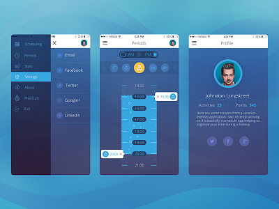
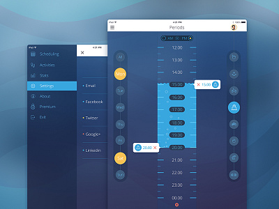
Hi guys! Today I want to continue sharing design from the Sea Schedule project. I am now presenting you the mobile version of this concept, adding profile screen which displays the number of activities and points of the user. It also depicts some more of social media integration showing the connected social network account on the profile page. I also tried to bring more vivid and bright colors to the overall scheme. I hope you will enjoy it!
This task is among many other we do daily here at Tubik Studio, applying our best experience in design to make the products successful and, moreover, viral. You can learn in more detail what makes the product viral on the stage of UX/UI design in our opinion by reading the latest article in Tubik Studio blog.


