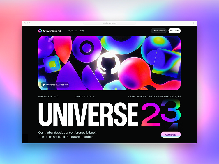
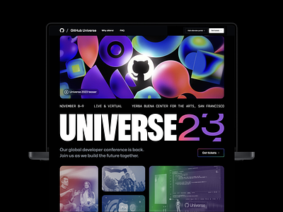
Github Universe tightening
Nicolas Solerieu is a master at composition and experimental typography. After a bit of a break from UI work, I tried my hand at redesigning and tightening his excellent spread.
Changes include:
Higher-contrast, lower-weight headline for legibility
Smaller, less-bold typography for detail work
Composition and alignment improvements
Gradient scrims for the year rotation so it fades away rather than cutting off abruptly
Brighter, more saturated brand coloring
Assorted contemporary UI detail improvements
See fullres:
More by Eli Schiff View profile
Like


