"Mincrm" Medical CRM Branding

🔗 Let's Connect:
Available for your long-term or short-term design partner.


Hello Everyone 👋🏻
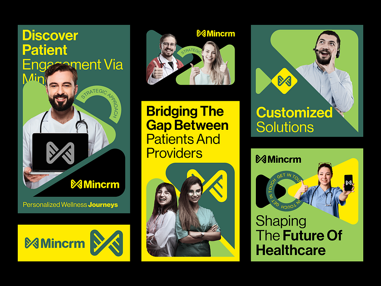
I'm thrilled to unveil my latest branding concept for Mincrm, the innovative medical CRM platform that is revolutionizing healthcare while embracing the vibrant colors of green and yellow.
I had the privilege to create a logo that embodies Mincrm's mission of "Bridging the Gap Between Patients and Providers" with the refreshing palette of green and yellow. These colors symbolize growth, optimism, and the harmonious relationship between patients and healthcare professionals.
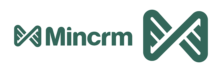
The logo's unique mark, a stylized "M" with an abstract bridge connecting two halves, is bathed in the invigorating shades of green and yellow. This metaphorically captures Mincrm's commitment to fostering seamless communication and collaboration in the healthcare industry while bringing a sense of positivity and vitality to the forefront. Designing this emblem has been an art of innovation and transformation.
I invite you to take a closer look at the logo and branding concept below. Your feedback is invaluable to me, and I'd love to hear your thoughts on this visionary project!
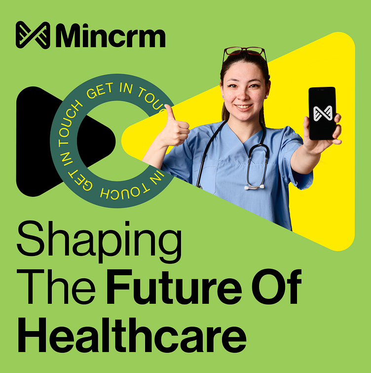
If you're interested in discovering how Mincrm is shaping the future of healthcare with the vibrant energy of green and yellow and enhanced patient engagement, please visit our website: Designops
Let's work together to create a branding design that not only connects patients and providers but also infuses healthcare with positivity and optimism!
Services we provide
-Branding & Logo Design
-Website design
-Mobile app design
-UI/UX design
🔗 Let's Connect:
Available for your long-term or short-term design partner.