Big Wave Awards Concept 2: Structure
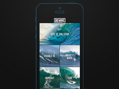
For context check out the first concept here.
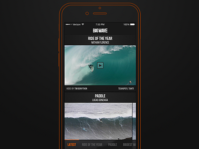
This second version takes a different approach to navigation and structure. The app begins with a feed showing the latest Big Wave videos, photos and news. Fans would then be able to navigate using a "scrollable" tab bar.
The benefits of this approach versus Concept 1 is the latest content is there when you open the app.
The challenging part of this example is that some of the tab bar is now hidden (not to mention it would have to be a custom iOS component). I could see Force Touch coming in handy here... Maybe that will be the next example :)
Check out the attachment for delicious retina pixels.
More by Adrian Phillips View profile
Like


