Monixo Branding!
The visual identity of Monixo, a prominent player in the field of cloud computing, has been meticulously crafted to encapsulate the essence of modernity and sophistication.
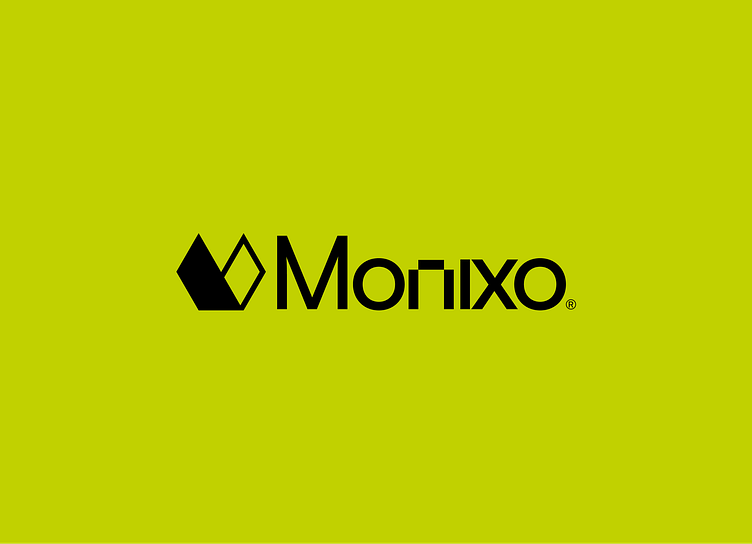
The 'M' lettermark is more than just a typographical choice; it is a strategic design element that signifies Monixo's seamless integration of cloud services into the modern business landscape. Its sleek, upward-leaning lines represent the company's agility and progressive mindset, reflecting its ability to adapt and thrive in a rapidly evolving industry.

Vector Build

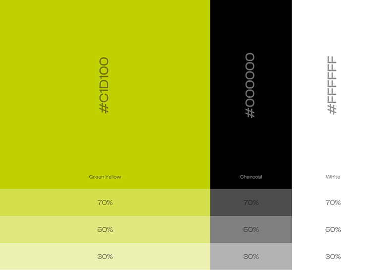
Color Palette
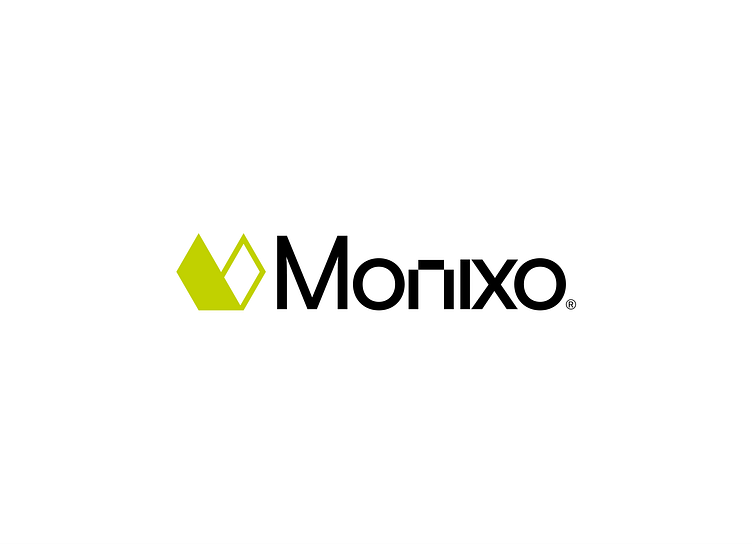
The choice of color palette further reinforces the company's brand attributes. Cool, muted tones blend harmoniously, symbolizing the reliability and tranquility that Monixo brings to its clients' operations.

Follow AyChris for more cool stuff.
======================
Fully available to work on your awesome projects, drop your business inquiry to :
E-mail: ayobamijemiseye@gmail.com
