Lora - Skin Care Branding
Hello Friends👋
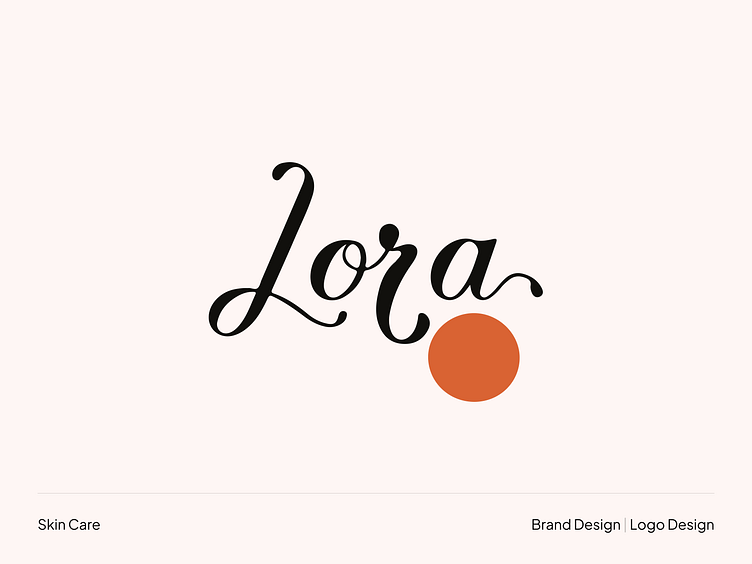
Lora is a new skincare product brand committed to providing its customers with high-quality, natural products. The brand is looking for a logo that will reflect its core values of love, passion, and care and its commitment to providing a holistic skin care experience.
Challenge
The brand wants a logo that is:
Simple and elegant
Memorable and unique
Versatile and adaptable
Able to be used in a variety of contexts, including on the brand's website, social media pages, and packaging
Solution
The logo design process began with thoroughly understanding the brand's values and goals. The designer then created a variety of sketches and concepts, which were narrowed down to two final designs. The winning design was a simple and elegant logo that combines typography and a circular icon. The text "Lora" is written in a sans serif font in a modern and minimalist style. The orange circle is a symbol of love and passion, and it is a reminder that everyone deserves to feel loved and appreciated. The logo's overall impression is luxury, sophistication, and care.
Results
The new logo has been well-received by the Lora team and its customers. The logo has been used on all of the brand's marketing materials, including its website, social media pages, and packaging. The logo has also helped to create a strong brand identity for Lora and has helped to position the brand as a leader in the natural skincare market.
Available for new branding and logo design projects.
Contact us 📧 hello@smartuxdesign.com
Brainstorm: Brainstorm ideas for the logo, using lines and shapes to represent the brand's values and goals.
Refine: Refine the logo design, making sure that it is simple, memorable, and unique.
Kerning is important for making text look balanced and visually appealing. It can also help to improve the readability of text.
Letter attachment can also affect the readability of text. For example, serif fonts typically have more letter attachments than sans-serif fonts.
The amount of kerning and letter attachment used will vary depending on the font, the size of the text, and the desired effect.
The "Lora" skincare brand logo is a minimal, luxury logotype that uses a sans serif font in a modern and elegant style. The orange color of the logo represents the brand's commitment to providing high-quality, natural products. The logo's overall design is simple and elegant, reflecting the brand's commitment to providing a luxurious and sophisticated skin care experience.
Dark version:
The dark version of the logo uses a sans-serif font in a modern and elegant style. The font is black, which is associated with luxury and sophistication. The color orange is used for the circular icon, associated with warmth, energy, and vitality. This version of the logo is more likely to be used in formal settings, such as on the brand's website or packaging.
Light version:
The light version of the logo uses a sans-serif font in a more playful and feminine style. The font is white, which is associated with purity and freshness. The color orange is also used for the circular icon, but it is a lighter shade of orange. This version of the logo is more likely to be used in informal settings, such as on the brand's social media pages or advertising materials.
I used high-quality, close-up images of the products, as well as images of people using the products and looking refreshed and radiant.
The packaging design for Lora is simple, elegant, and luxurious. It uses the brand's signature orange color and features high-quality images of the products. The mockups are used to visualize the packaging design and help ensure the effectiveness of the skin care brand.
Have a project idea? We are available for new projects.
→ Reach out to us using any of the links below to learn more.
📮Send Email
📅Schedule a meeting
. . . . . . . . . . . . . . . . . . . . . . . . . . . . . . . . . .
Let's Chat👋 About your project! 👇
Follow us to see more works!
Dribbble | Linkedin | Behance | Instagram | Telegram | WhatsApp


