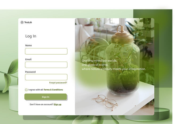
Sign Up UI Design
Hi, Dribble community! 👋 I'm starting off with my DailyUI challenge today and I'm so excited to share it with you guys :)
DAY 1
This is my first UI design for a terrarium sign-up page. For the main color, I focused on using green and white to show its simplicity and user-friendliness. Any feedback would be great for a start 🙌
Leave 💚 + comment 💬 if you like this UI design as much as I do, thank you!
More by Christine Hampton View profile
Like

