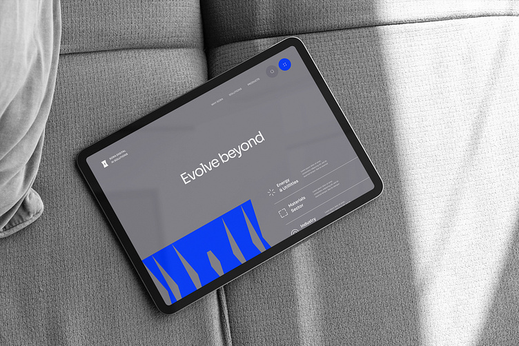
Minimalist Website 🎈
In terms of clean design, layout, and content, a well-executed minimalist website load's faster, and enhances user experience more effectively than a complex website.
That's the primary reason, minimalist websites has emerged as a prominent trend. Yet, achieving an impactful minimalist website design can be quite demanding.
Even when we are creating a text-based website, it remains possible to craft a visually pleasing Minimalist design with a well-defined and user-friendly visual hierarchy
Key core factors to consider when designing the website apart from the trend:
〰 The website requires a strategic approach to showcase our services, establish credibility, and attract potential clients.
〰 Clearly defining our brand identity, including our mission, vision, and core values.
〰 Develop a unique value proposition that highlights what sets your tech solutions apart from the competition.
〰 Understand our user's pain points & their needs.
〰 Determine the specific industries, businesses, or individuals you aim to serve with our tech solutions.
〰 Organize website's content logically with a user-friendly navigation structure.
〰 Consider a top-level menu with clear categories to showcase your services, case studies, blog, and contact information.
〰 Incorporate clear and concise messaging that resonates with your target audience.
〰 We should ensure our website is accessible to all users, including those with disabilities, by adhering to web accessibility guidelines.
More about us on
Dribbble :
Youtube :
〰 Want to create exceptional products? Meet our talented #designers at our hogoco® | Studio Bengaluru! 🏄🏻♀️ 🏂🏻 ⛷ 🏇🏻 💥 🎈
#designstudio #hogocostudio #hogococreativeagency #minimaldesign #minimal #minimalist #minimalism #hogocodesignstudio #creativeagency #uiuxdesign #bangalore #uiuxdesigner #uxdesign #designagency #designers #designerslife #cleandesign #minimaldesign #conceptualdesign #conceptdesign #userexperience #uxdesign #brand #brandingagency #branddesigner #brandingexpert #hogoco #designagency #branddesigner #uiuxdesign #uiuxstudio #bangalore #india #brandagency #website #websitedesign #webdesign #webdesigning #moderndesign #inspiration #mobileux #uiuxdesignstudio #tech #techwebsite #websitedesign #cleandesign #futuristicdesign


