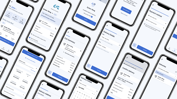
Cure Pharmacy Case Study
A pharmacy delivery app with an easy auto-refill function designed for patients to easily access and manage their prescriptions.
Problem
Many people are interested in filling prescriptions online but worry it might be complicated, particularly older adults who are less tech-savvy. This reliance on traditional methods like phone calls and in-store visits can be inconvenient for both full-time workers and the elderly.
Solution
To create a simple and intuitive ordering process for patients to manage and fill their prescriptions.
Sitemap
To create the responsive versions of the dedicated app, I have created a sitemap to understand the organizational structure of the screen pages to ensure a consistent experience across all devices.
Responsive Designs
The design accommodates various screen sizes, such as mobile, tablet, and desktop, with additional optimizations for desktop to maximize screen space. While the dedicated app primarily emphasizes prescription refills, the responsive versions offer a comprehensive overview through the desktop layout.
Impact
Users have shared that they find the app extremely easy to use; they all appreciate the color choice for providing security and safety. Furthermore, being able to choose the delivery date and time helps align medication deliveries within the same timeframe.
What I learned
I realized that dedicated apps and responsive mobile sites come with their own quirks. So, I aimed to give each its unique touch while staying true to the brand identity. This project was both enjoyable and challenging due to the multiple screen variations I had to work on. I ran into a few roadblocks along the way, but in the end, I managed to create a seamless user experience.
Thanks for reading my case study.
You can check out my full process deck here.


