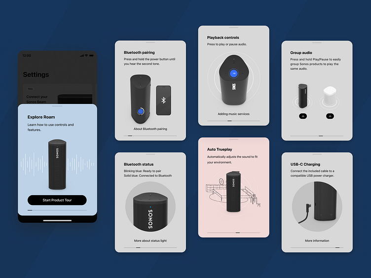
Roam Product Tour
For the launch of Roam, our ultra-portable smart-speaker we created a scalable framework to educate users about product functions, features and capabilities.
The product tour needed to clearly demonstrate functions and features that would best aid Sonos customers to get the most out of their products and system.
This new onboarding module would also give us the added benefit of having shared, consistent language and visuals for how we communicated concepts both internally and externally.
An additional challenge as this was being designed was that rules we established in Roam's onboarding needed to set the precedent for how Onboarding would extend across the entire product portfolio, with products of vastly different capabilities and physical dimensions.
Initial Explorations
Slide 1: Initial explorations for different concepts highlighting button presses, playback shortcuts, and more. For all of these I was posing the product by hand in After-Effects in Element 3D.
Slide 2: Alternate view of how the card was considered with the asset instead being a more overtly contained image.
Final Proposal
The full suite of final assets and copy for Roam's onboarding.
Example diagram showing how the module comes to life. Video production would have been costly and inefficient for asset maintenance and creation, so I instead opted to use a mix of Rive flare files and still PNGs.
By stacking Rive assets and PNGs, the appearance of a fully integrated, on-product animation comes to life. Each asset has a naming convention that alludes to where it should exist relative to a PNG image in the z-order (BG for Background, FG for Foreground).
Roam's animated assets
Full Roam product tour as it appeared at launch.
Roam's product tour appears in reviews!
It was great to see positive feedback about the product tour. Tech reviewers frequently showed it as an accompanying visual to describe hardware features or cited it as a feature they found helpful.
Thanks for viewing!


