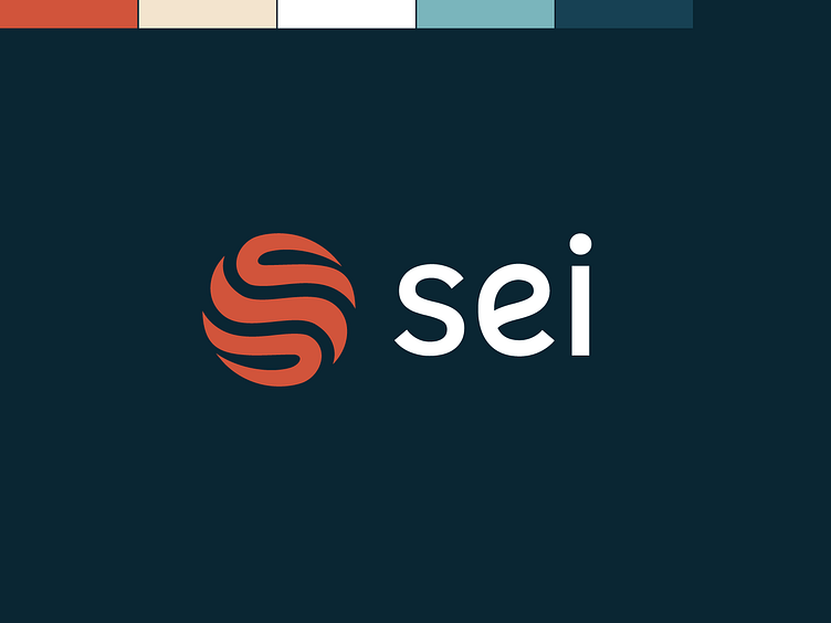
Sei Logo Redesign Concept
This is an experimental redesign of Sei's logo. Sei is currently the fastest Layer 1 blockchain, designed to scale with the industry.
The inspiration for the logo and color palette comes from the images they use in their marketing which include an orange ball in a zen garden. The ridges in orange ball also suggest movement, which reinforces the speed of the blockchain tech. In addition, the ridges shape the letter "S" (obviously the first letter in "Sei").
Let me know what you think!
Contact us if you'd like help revamping or rebranding your Web3, Crypto, or Blockchain project:
More by BRND3 View profile
Like


