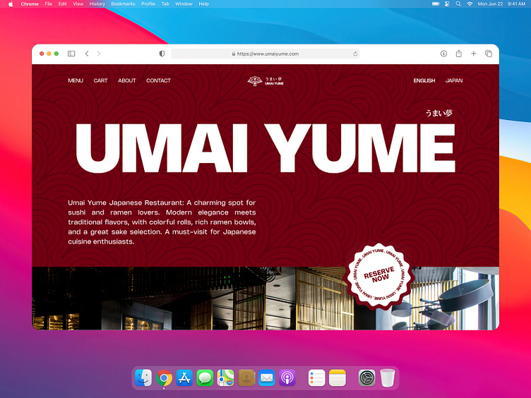
Umai Yume - Japanese Restaurant Landing Page 🍜
Hello, Dribbble! 😁
Today I'd like to share my new exploration of a Japanese Restaurant Landing Page called Umai Yume. Don't forget to scroll, to see full of my work
I hope you guys enjoy it and press "L" if you like it 😉
Any feedback or comments? Feel free to leave comments below.
Overview 🍜
Umai Yume Japanese Restaurant is a charming spot specializing in sushi and ramen. With a mix of modern elegance and traditional touches, it offers a delightful dining experience. The sushi bar showcases colorful rolls and fresh sashimi, while the ramen bowls are rich and comforting. Friendly staff and a great selection of sake complete the experience, making it a must-visit for Japanese cuisine lovers.
Brief 👀
Makes design websites looks modern, elegant, and bold
Preview 🎯
This is a preview of a Umai Yume Landing pages
Full Landing pages 🍣
Here is the result of the Landing Page Umai Yume
Solutions ✨
Result: So, I made the design concept Bold and clean. So I made the header of the landing page highlight the color red because the attention of the user is a header, and then users can see the about us. And for the last, I combined the logo and pattern Japanese for landing pages
Mockup Preview 🖼
This is a mockup preview for the Landing pages of Umai Yume on Macbook
Thanks for checking us out!
We'd love to hear from you. Let’s make something amazing project together
We are available for new projects mobile app design, landing page design, illustration, and logo design — contact us at hellow.uranus@gmail.com


