KptnCook Logo
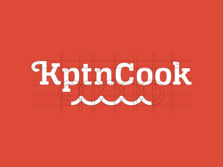
Hey everyone, this is a little peak into the creation of the KptnCook Logo. The basis of the logo is the font Alianza Slab from Corradine Fonts. Alianza is an amazing font family! We tweaked the K, the serifs, and combined it with a wave element. The wave symbolizes the exploration of a Captain at sea and the importance of water. In cooking, exploration and water are also essential. :-) And yes, we decided to abbreviate Captain to Kptn.