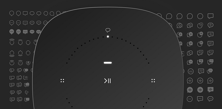
Voice Assistant Icon (On-Product)
For a new hardware release, I was tasked with creating a new icon that would go on top of the product. The new Era family of products has hardware features that take advantage of microphones (such as Auto Trueplay tuning) as well as a voice assistant which requires a microphone for user interaction.
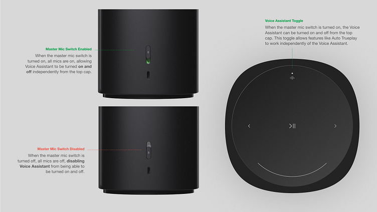
As we separated the idea of enabling microphones from enabling voice assistants on our hardware products, we need to explore potential iconography for this new capability. This is a look into how we achieved the final result that you can see live on both products today.
A lot of options were considered. Very lightweight, very visually dense, filled, un-filled, literal, abstract, dozens upon dozens of treatments were drawn up.
A summary of the prompt: historically a Microphone icon means voice assistant, but our hardware has features that use the microphone for tuning related features - this meant that we needed to separate the visual treatment of a listening microphone from one that meant voice assistant.
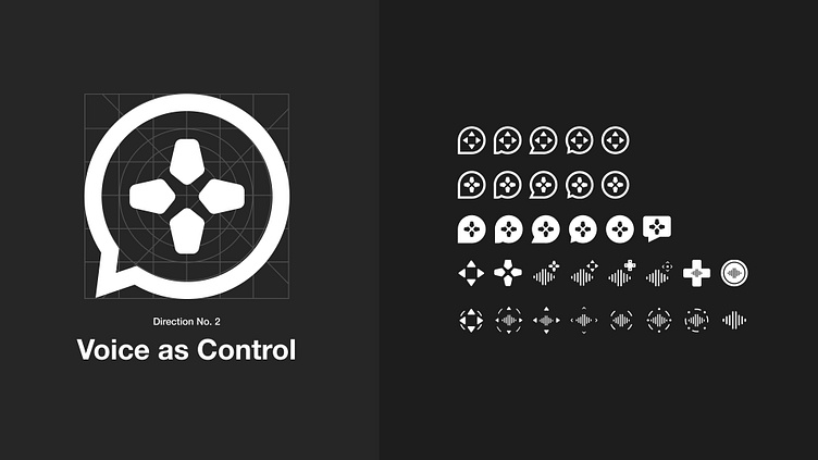
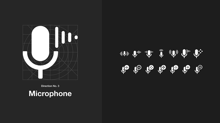
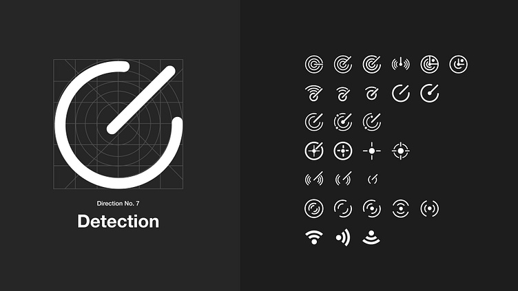
In my first swing, I went very broad. I was exploring a world where both the back-switch that toggled the microphones off and on and the actual voice assistant icon would both be reconsidered. I explored new variations on the microphone to hopefully be more direct about what it was correlating to, directions that were meant to allude to the "tuning" nature that would be enabled, and even focuses that were meant to be anchored around security.
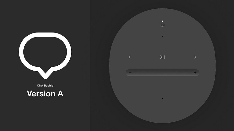

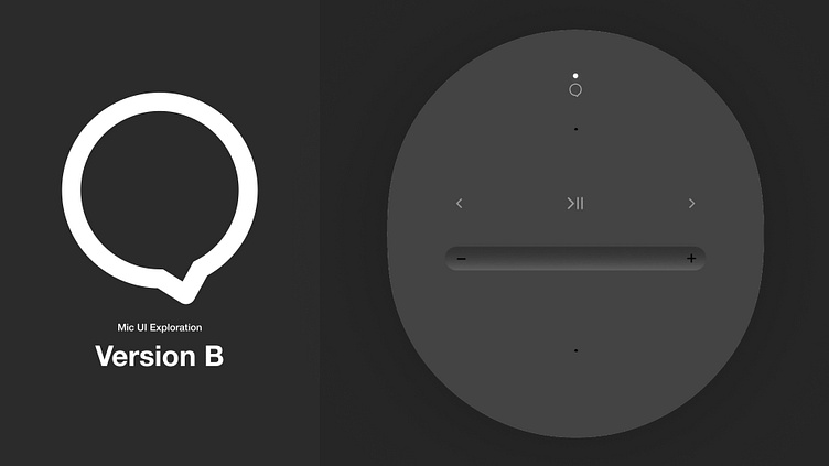
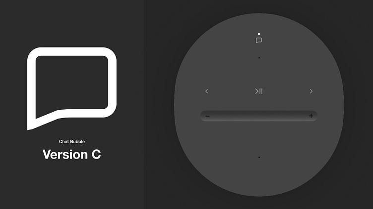
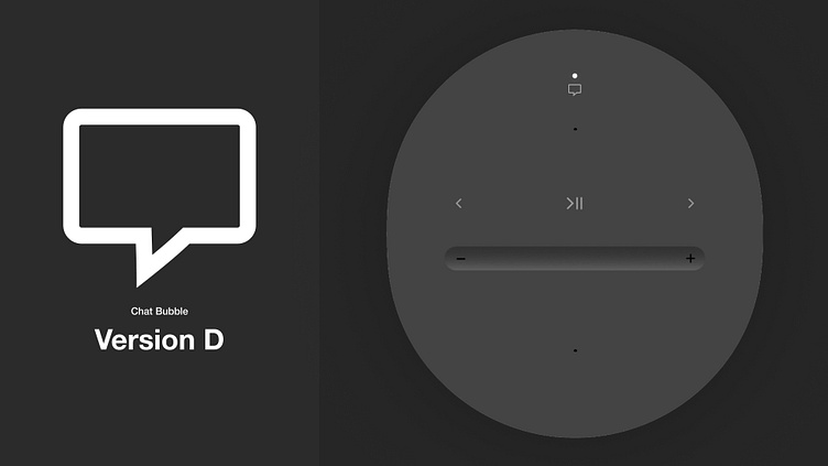
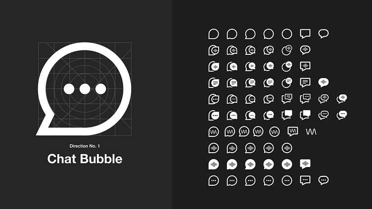
After an initial internal audit, we were drawn towards directions that had a "chat bubble" analogy. It was a visualization that lent itself well to the idea of an assistant speaking back to you.
As I was narrowing down, I was probing about how much detail was necessary (or desirable) for a user to understand the full intent of the icon. From here we started conducting user tests to see if any clear winners could be identified.
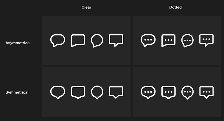
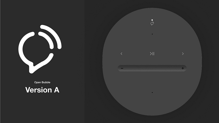
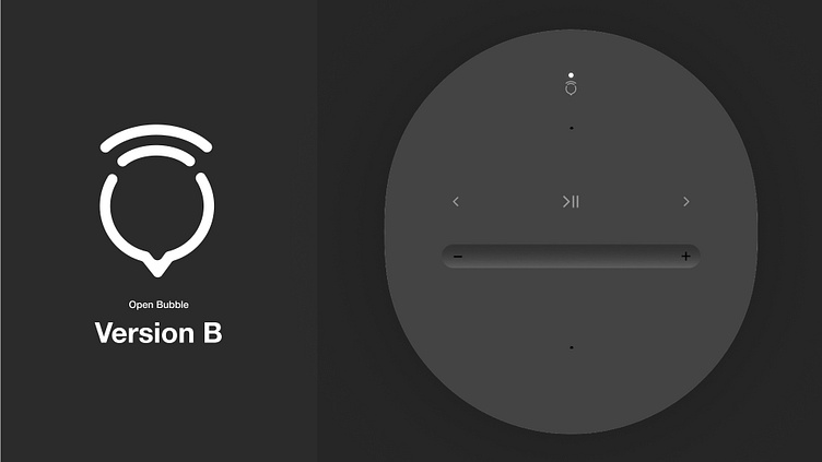
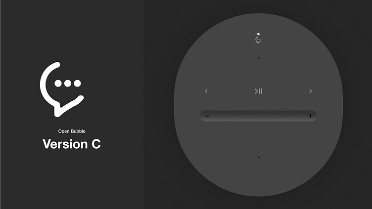
We started getting more confident, learning that users understood more simple chat bubble visuals, and tended to prefer rounder shapes. We received feedback about the more geometric treatments to the effect of "it looks like it'll trigger a chat bot."
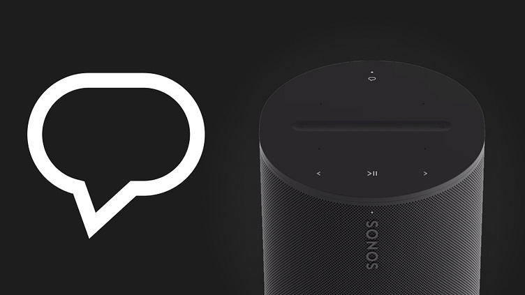
Across 100+ tests, more than 2/3 of users chose the same icon as best representing voice assistant. Users described it as feeling conversational, familiar, and most importantly: easy to understand.
And now you can see the icon live on the product, hopefully for many, many years to come.
Thanks for viewing!