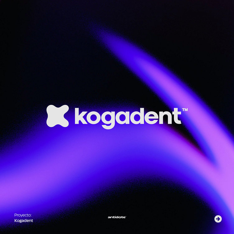
Kogadent™ Project (Odontology)
The isotype's design combines curved shapes and subtle lines to create a stylized representation of a molar, while the "K" seamlessly integrates to form its structure. This creative and unique approach reinforces our identity and sets us apart in the dental industry.
The choice of colors reflects our professionalism and confidence. We use shades of blue and white, which convey a feeling of cleanliness and freshness, while evoking confidence and tranquility in our patients.
The Kogadent logo is always presented in balanced proportions and its use must be consistent in all visual identity applications of the brand. It can be used in different formats and sizes, ensuring its readability and recognition in any context.
More by Antidote™ View profile
Like


