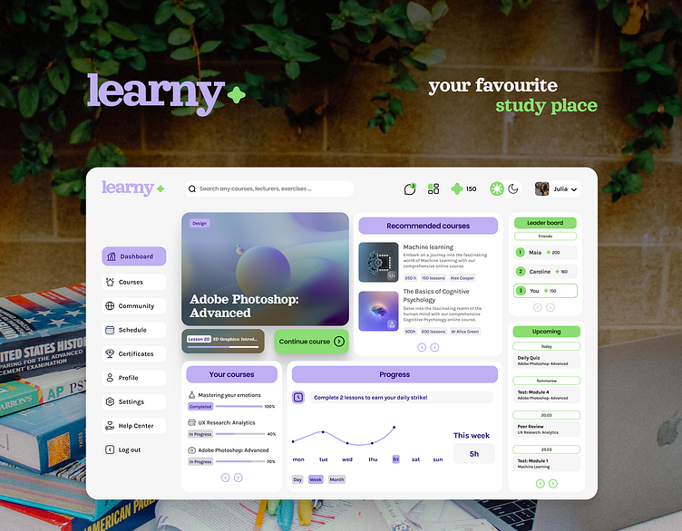
Learny 👩🏽💻 e-learning platform
🙌🏼 Project Name: Learny, e-learning platform
✨ work in progress ✨
Recently, I've been working on designing an e-learning platform. Please take a look and leave a comment 💚 I appreciate your feedback!
🫂 Empathize
Observation (as an element of UX research and Competitive Audit)
analysed the most popular platforms such as Coursera and Udemy
considered competitors' strengths, weaknesses, gaps and opportunities
🙋🏻♀️ Created Persona
🔎 Define User Main Problems
🙁 lack of motivation to start and continue the learning journey
🙁 lack of sense of community
😃 E-learning platform that has an easy and intuitive navigation, motivates to start and continue user’s learning journey and gives sense of community.
🧠 Ideate
Inspired by the most popular layouts and features to ensure user-friendly and intuitive navigation, I aimed to enhance the platform's uniqueness by introducing or modifying certain elements. For instance, I added features such as the 'Challenge Someone' and the 'Ask the Lecturer'.
💁🏽♀️ Log in / Sign up
💁🏽♀️ Dashboard
💁🏽♀️ Course Overview
⭐️ Scroll selection: I decided that only the section with Course Description, Lesson Breakdown and Instructors list will scroll - and the most important information about the course along with the “Start course” Call to Action button will be constantly available for the user (so that when user finish reading all information does not have to scroll all the way up to start the course).
💁🏽♀️ Single Lesson Screen
⭐️ Changes in Menu Bar: I decided to minimise Menu Bar to icons only, because I wanted to obtain more space for the main Lesson section. While hovering the Menu Bar returns to its previous state with labels.
💁🏽♀️ Community
⭐️ Each Course has its own Community: Participants can add posts, comments, sending direct messages and challenging themselves. Users can easily switch to the community of a different course.
💁🏽♀️ Summary
🧷 The platform engages its users with the following features:
Streak Notifications: Users are motivated to use the app on a daily basis to keep their streak active. This improves consistency in learning process and guarantees better results.
Challenge someone: Call to Action that provides the opportunity for competition among course participants.
Continue course: Call To Action that simplifies resuming right where the user previously finished.
🧷 The platform gives a sense of community through the addition of features such as:
Community module with discussion section, leader board and direct messages
Peer Reviews
“Ask Lecturer” feature
🧷 To ensure that platform is accessible, I checked colour contrast and text readability. I used the A11y Plugin to ensure that design is compliant to at least AA standard. Furthermore, I maintained a minimum font size of 10 pt for small labels with font size of 16 pt as the primary size. To enhance usability, the platform provides a dark mode feature and option to personalise user’s dashboard layout.
I created gamification elements like awards (points/ badges), streaks, leader board and “Challenge someone” feature.


