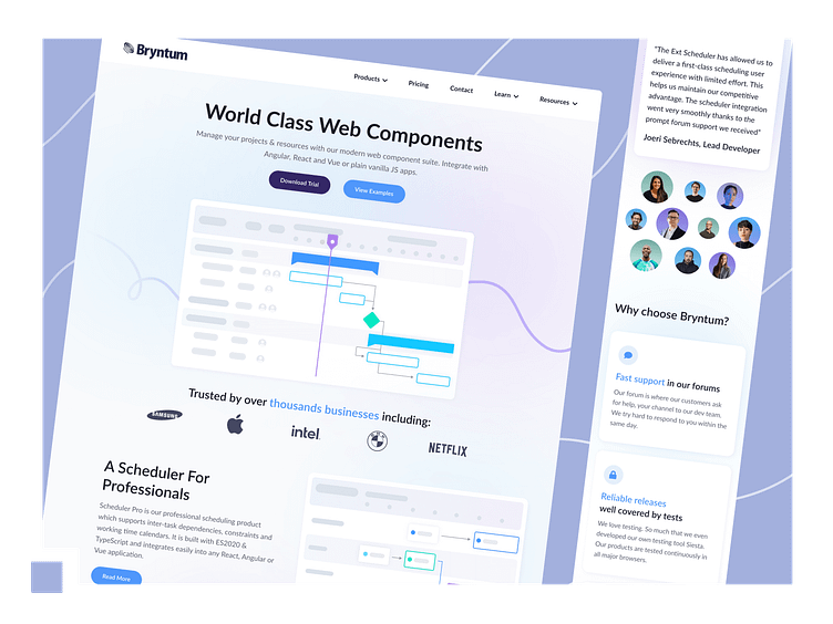
Updated Bryntum's website for a modern look
Hello Everyone 👋
Here’s how we updated Bryntum’s website with a modern look and easier navigation!
🎯 About Bryntum
Bryntum — created in 2009 with their HeadQuarters in Sweden — produces web components, perfect for project management and resource scheduling.
Their web components include Gantt charts, Calendar, Scheduler, Kanban, and many more easily-integratable elements that fit any web app whether it’s based on JS, Angular, React, or Vue.
Numerous worldwide-known brands, such as Netflix, Apple, Samsung, BMW, or Shell, have previously worked with Bryntum, being a part of their over 5-thousand big customer base.
⭐ Root Cause & Goals
Bryntum’s website, just as its brand, grew to be quite big and complex. But even though the site grew, its designs remained the same.
Bryntum realized their website needed a little user intuitiveness improvement, aside from just upgrading the designs to be more modern. So Mats Bryntse, Bryntum’s CEO reached out to us to help them achieve the following objectives: a modern look & improved user intuitiveness.
⚠️ Problem #1 — Outdated Look
Our Client specified that they’d prefer a lightweight and modern theme. So our design and dev teams got to work to create a renewed, yet brand consistent look.
To keep the new website in harmony with Bryntum, we’ve decided to keep its blue tones in. And to add some depth and make it more unique and interesting, we’ve upgraded the website’s colorway by adding some purple into the combination and making the background a bit brighter.
⚠️ Problem #2 — User Intuitiveness
Improving user intuitiveness was the next issue we got to fix.
Bryntum offers four ways their products can be licensed to developers, which they use for creating applications or complete projects.
The issue with the way the old Pricing page was designed was that it was a bit confusing to Bryntum’s clients, which made choosing the right option challenging. Their clients often selected a license for commercial use instead of the EUL one, making the purchasing process much longer and much more difficult since Bryntum had to manually fix that mistake.
To change that, we’ve started by analyzing the original Pricing page and then got to redesigning it to show the four options in a much clearer and understandable way.
We started working on the presented designs, while the project and the demands changed throughout it, eventually forming into something a bit different.
But that’s the beauty of creation, isn’t it?


