EcoKids Website
Mini Case Study
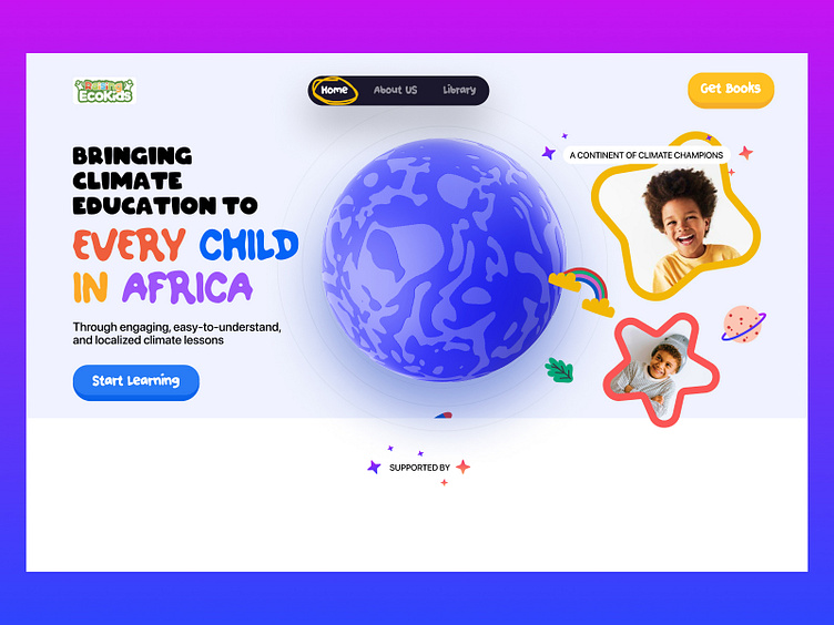
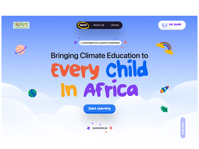
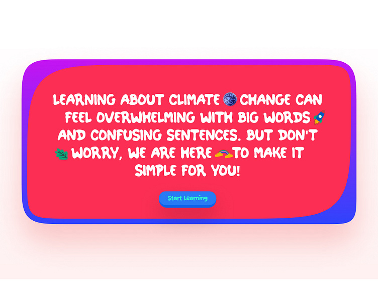
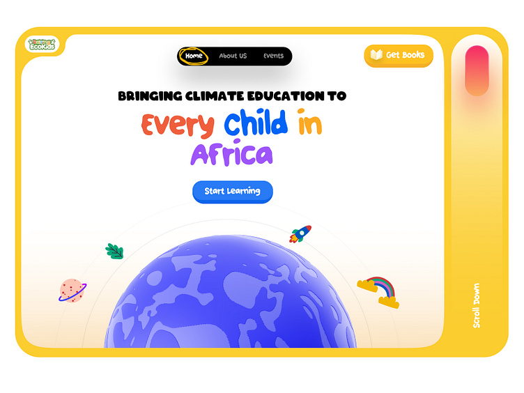
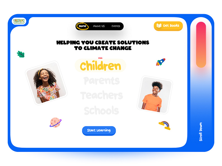
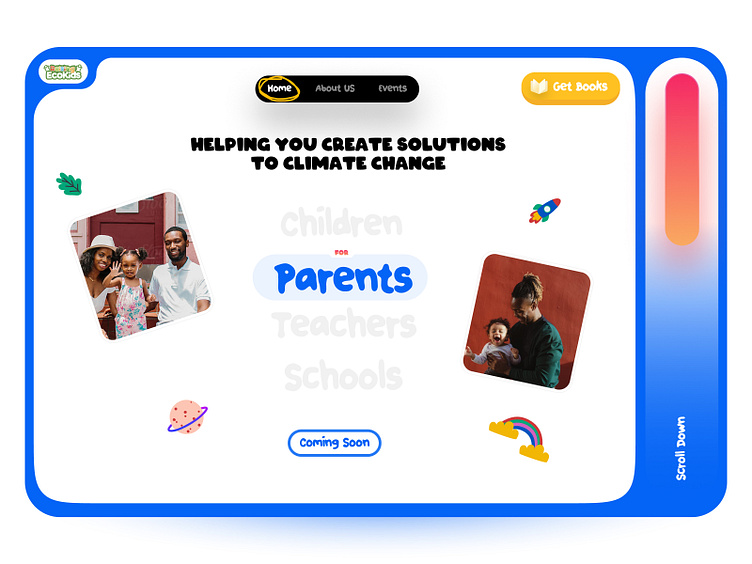
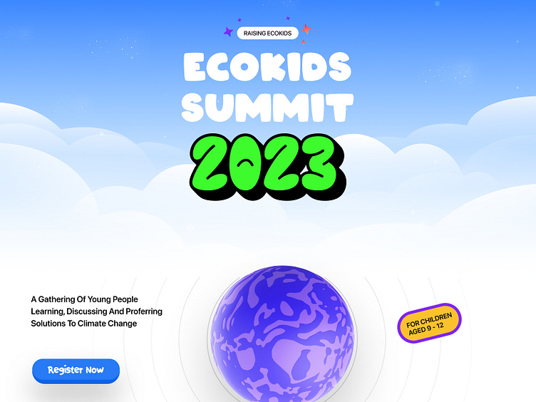
Ecokids is one of the projects I volunteered to work on last month. Explored a few directions but loved that we ( Mostly Simi ) settled for this. Recently, I got a tablet for one of my baby sisters and I watched her interact with it and it was interesting how fun and gamified the interactions were. And that was why I explored this direction and not the usual long scrolling, SASS looking web design. Although, because parents are who will most likely be first-time users of this interaction/experience, had to have a balance in there. So the question was if a parent visited this website, does it feel like an environment they would want their kid to be in.
Elements
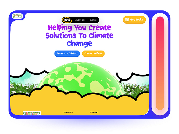
The "Earth-Ball" - Didn't want to use an actual earth render here cause kids perception of what the earth looks like is not necessarily that detailed and I didn't want to overcomplicate things. So; A Round-Rotating Blue Ball was enough
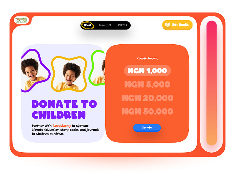
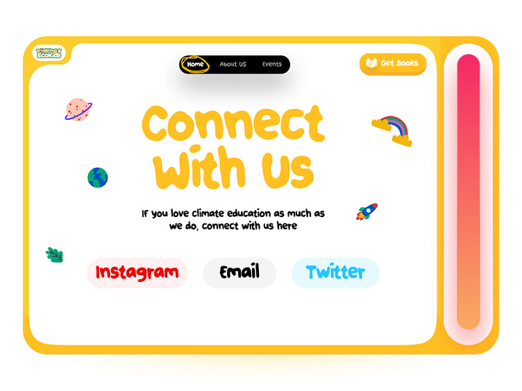
NavBar - The active states for this one was what made it interesting actually, I used a pen tool to draw a rough "circle" around the active nav text. Exactly how a kid would do it. It was not going to be a perfect circle on line like
The Loader - Got inspired by Cocomelon for this one. Cocomelon has this bouncy effect and I tried to do that with the loader too
I think you probably see a pattern now anyway. The Button, Font Choice, Icon/Illustration. You can DM if you found any other easter eggs 😅
Some other pages
Explorations that didn't make the final cut