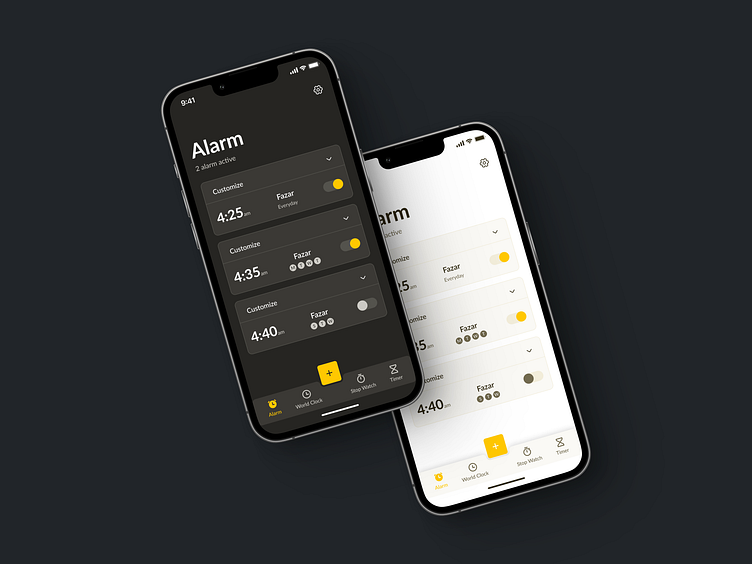
Minimal Alarm Clock App Design
🚀 Just Designed an Innovative Alarm App UI with Light and Dark Modes! 🌅🌌
Excited to share my latest UI/UX design project! As a dedicated UI/UX designer, I've been working on creating an Alarm App that prioritizes user-friendliness and aesthetics.
Check out the highlights:
✨ Light Mode & Dark Mode: User preferences matter! The app seamlessly switches between light and dark modes for a visually pleasing experience, day or night.
🔍 Card-Based Design: To prevent accidental clicks and make navigation a breeze, every option is neatly organized into cards. No more worrying about tapping the wrong setting!
➕ Effortless Alarm Management: Adding alarms is as simple as tapping the plus button, while modifying existing alarms is just a click away using the dropdown icon. Your mornings just got smoother!
🕰️ Convenient Alarm Controls: The alarm on/off button is prominently placed for easy access. No more fumbling around when you need that extra snooze.
⏰ World Clock Functionality: Stay connected globally! You can add your favorite cities to the World Clock screen. Each city card includes current time, weather info, day, and date, making it a one-stop solution for staying informed.
⬇️⬇️⬇️ Light Version ⬇️⬇️⬇️
Give me some ❤️ if you like this design.
Wanna Collaborate with Me?
🌏 Visit : www.OntorDesigns.com
🤩 Behance : Nasimul Noyon Ontor
⬇️⬇️⬇️ Dark Version ⬇️⬇️⬇️
Let's talk about your project
📩 Email : OntorDesigns@gmail.com
⬆️ Upwork : Nasimul Noyon Ontor
Follow me to see more exciting shots and insights on:
Behance I LinkedIn I Facebook I My Website


