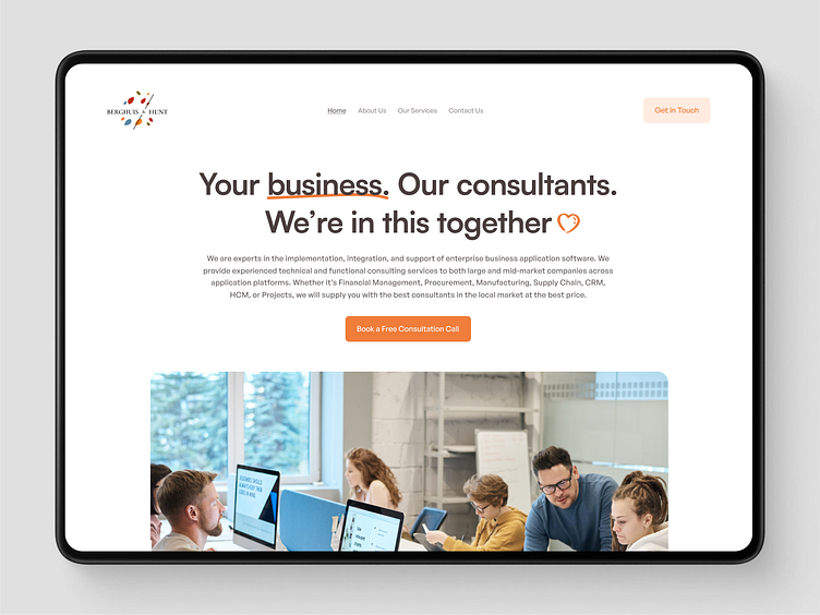
Berghuis & Hunt - Consulting Company Landing Page Redesign
About the project:
Berghuis & Hunt, is a leading consulting services company connecting consultants with businesses of all sizes at competitive rates. Their website, however, faced a significant UX challenge due to intricate navigation and a confusing layout. Additionally, the site was overly text-heavy, and lacking visual appeal.
So i decided to revamp their existing website in just 3 hours :)
Let's dive into the UI/UX transformation part!
My Solution:
In my quest to enhance Berghuis & Hunt's website, I tackled complex navigation and a text-heavy layout head-on. Streamlining navigation for a smoother user experience and introducing visuals for added engagement. The result?
A revamped landing page that's both visually appealing and conversion-driven.
Berghuis & Hunt Revamped by Sameer Siddiqui
It's one of the redesign i created one year ago. I'm just sharing to be more consistent on Dribbble and to motivate other to post whatever you create!
There's always an audience for the work you do :)
I hope you like it ❤
Follow me for real daily app and web design inspiration ✨
Have a project?
Email me at: sameersidd.design@gmail.com or message me on Dribbble!
That's All Folks!
Become a part of my community to learn more about UI UX.


