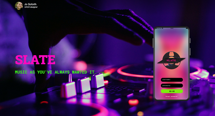
Slate
Create an 80's themed music app
My Role: UI Designer
Target Audience: 35-50 year-olds
Social Blend: A music platform that also allows blogging and community
Tools: Figma
The design caters to 80's digital aesthetics, queer adults, and social music experiences
Competitor Research
To begin I sought out fellow music apps to compare what is presently available to users
Discoveries
Music App Standards regarding listening, playlist creation, and social media sharing
Different app's ability to upload your playlists
Compared search functions
User Journey
I decided the most exciting combination would be an app that enables users to not only listen to and share music on other platforms but to blog in-app about the music they love. The ability to blog about the music they love would allow users a communal atmosphere that was so key to music cultures in the 80s.
Guiding Questions:
The app would allow users to have a homepage filled with friends' posts
The app would allow users to direct message their mutual friends
The app would have staff-curated playlists featuring queer music
Commenting would be enabled on posts and playlists
Sketches
I started my process with low-fidelity paper wireframing. This allowed me to explore the idea of my app in a quick and easy format.
Intentions:
To discover the best flows for a social music app
I made four different versions
I chose the layout that included chats and staff recs
My competitor research influenced my flows by combining styles inspired by Tumblr, 8tracks, and Spotify
Inspiration for this app came from digital fonts of the time, neons, and various queer creations. Inspirations were drawn from zines, music, art, and fashion of 80s queer subcultures.
Wireframes and UI Design
Once I moved on from paper I started designing in Figma. I then made mid-fidelity wireframes before moving on to high-fidelity
As I was moving from mid to high fidelity I went through a few different color palettes. The 80s were an exciting time for color, and I was particularly inspired by neons. Eventually, I landed on a cream background to balance out the neon highlights.
What did I learn on this project?
I had a fantastic time on this project. The brief's requirement for 80's aesthetic was perfectly aligned with my sensibilities. Along the way, I learned a lot about bringing a digital design from concept to professional mockups.
I learned to keep different files for different iterations.
As I moved through this project I had a handful of different color palettes that user testing was able to narrow down via thorough feedback
Balancing muted and neon colors


