Moonstruck
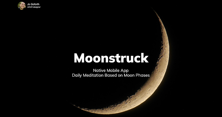
Career Foundry tasked me to develop an app within native mobile constraints. The app idea that came to mind was one that provided users with daily meditation based on the moon's cycles, as well as space to create their own journal entries and track notable celestial events.
Designed an app for HIG and MD constraints
Target Audience: 25+. The app would provide a place for daily reflections and meditation.
My Role: UI Designer
I was very much inspired by "The Astrological Grimoire" by Shewolfe and Beatrix Gravesguard. Test copy for the meditations was also referenced from their meditations. Their book goes through the year and provides the reader with meditations based on the moon, as well as monthly alter suggestions. My app idea was to reference their format while creating a portable journal so that users can have moon meditations and their personal journal at their fingertips.
Competitor Research
Before delving into my own user flows and wireframe designs I spent some time doing research. Multiple moon chart apps and journal apps gave me ideas of both what was on the market, what worked well with these apps, and what Moonstruck could provide that the existing apps could not.
User Journey
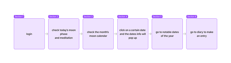
I mapped out the users’ steps to provide focus to the app. Each wireframe would stay focused on letting the users achieve their goals hassle-free.
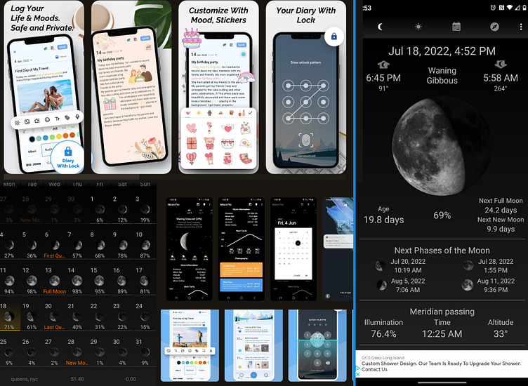
The most important goal of the app was to allow users to access daily meditations. As soon as the users log in they are to be met with the phase of the moon and their daily meditation. The rest of the app would complement this goal, but this is the priority, so it was important to ensure the user could access their meditations immediately. The following steps were curated to complement the main purpose of the app.
The users then have access to a monthly moon calendar, where they can tap any day and see the phase of the moon for that day. If the user clicked a date in the past it would open up to show the past meditation and their journal entry from that day. There were only two other pages designed: a notable celestial events page, and a dedicated journal page.
Each step was tailored to give the users a sense of ease. Since the app is focused on meditation, no elements should impede their ability to focus and relax.
Sketches
After doing competitor research I moved on to quick paper prototyping. This allowed me to go through several iterations quickly and cheaply. I created five different versions so that I could compare the differences and debate the most optimal flow. The main differences were found in how complex or paired down I made each page, as the main user flow was quite clear. I ended up going down with a paired-down version. This seemed the most in line with the purpose of the app.

UI Desing
After crafting low and mid-fidelity wireframes from these sketches I moved on to high-fidelity by incorporating HIG and MD native elements, such as the top bar, and bottom, bar, and creating text styles with HIG and MD typographic guidelines. After I added all the native elements, I moved on to the app's specific design, while still incorporating respective design styles for the two versions of the app.
Since this app encourages reflection and was tied to the moon I decided to go with a simple, dark theme. This allows the app to be easy on the eyes and lets the user find the information they desire without distraction. I particularly enjoyed incorporating the meditation card. Having each paragraph of the daily meditation featured on a separate scroll forces the user to take their time while reading, and really think about each section of advice.