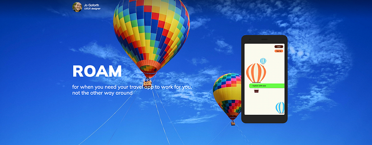
Roam
The Objective:
To design a responsive web app for location-based recommendations that meets the requirements of its users and solves the problems they face with existing location-based recommendation apps.
Target Audience: users who need an accessibility-first platform
The Problem: creating a responsive web app that caters to diverse travel experiences
My Role: UX/UI Designer
Solutions: Accessible Color Palette, Familiar Interface, and Robust Accessibility Settings
Tools: Figma, Paper Prototyping
User Interviews
After creating my hypothesis, I set up interviews with potential users to get a clearer picture of what was missing from their travel experiences. To start I interviewed three people.
The initial hypothesis was that there would be a desire for an app focused on last-minute travel plans.
Interview Questions:
How often do you stick to a pre-arranged travel plan?
In the past what were the main causes of disruption to your travel plans?
What information do you wish you had readily available while traveling?
Have you used travel apps before? Why/Why Not
If so, what features do you wish were available?
What causes you the most stress when traveling?
What causes you the least amount of stress when traveling?
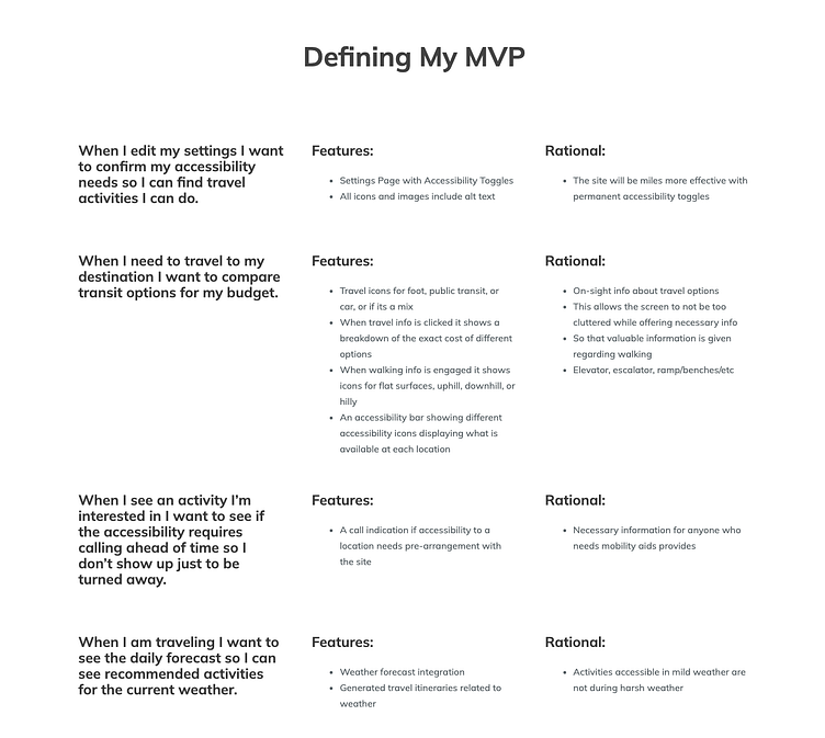
After conducting these interviews I discovered that the primary focus should be accessibility settings, whether that be for physical or financial concerns.
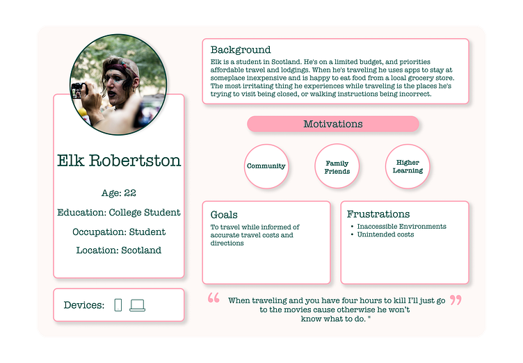
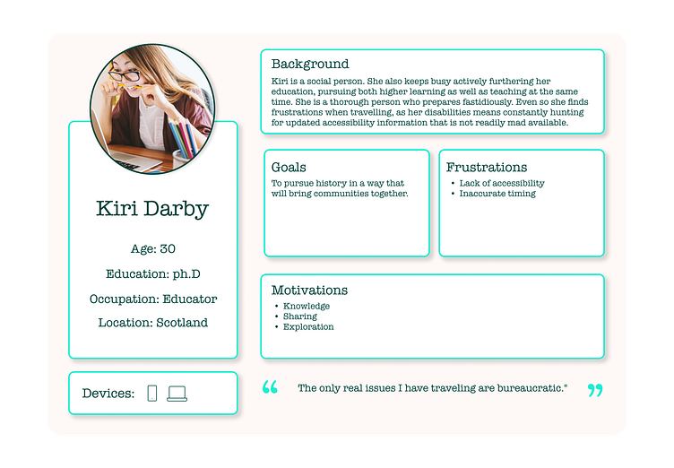
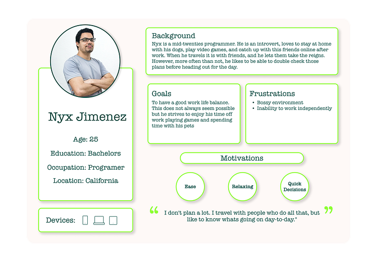
Personas
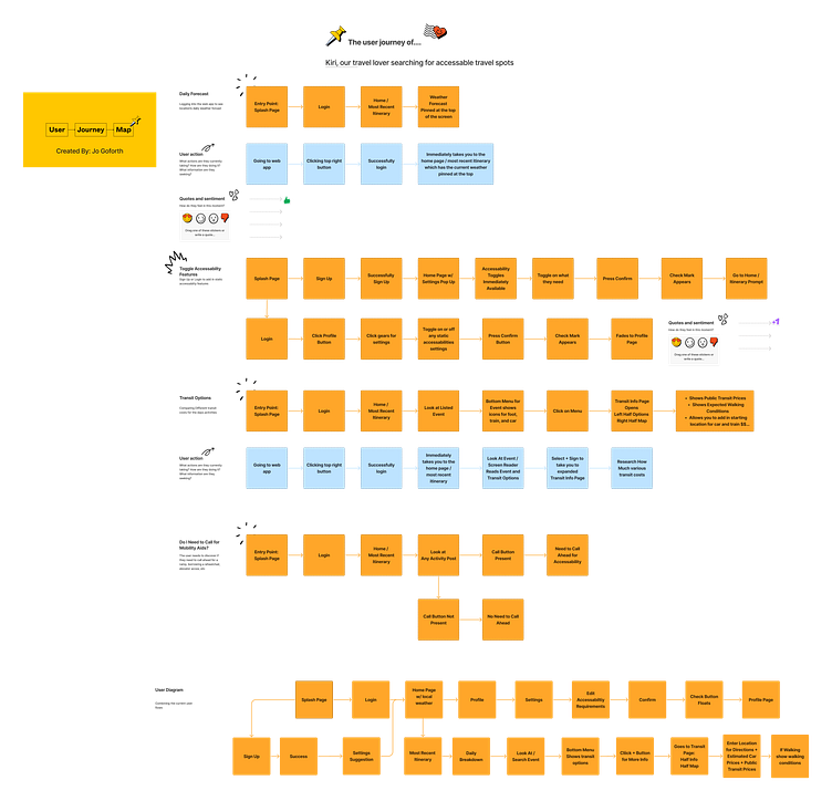
Based on the user interviews I conducted, I then crafted user personas to focus the scope of the project.
Guiding Questions:
User Backgrounds, goals, frustrations, and motivations, as well as what devices they use were all provided
The personas guided the design towards physical and financial accessibility
These personas acted as the foundation for my design principles.
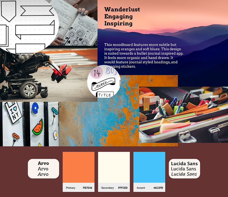
Project Mood Board
I ended up inspired by bullet journals. Bullet journals have a lot of fun and fresh title blocks and aesthetic styling that make planning fun.
I also went for this orange and blue color palette because it compliments the energy the project was aiming for, as well as is one of the most accessible color palettes.
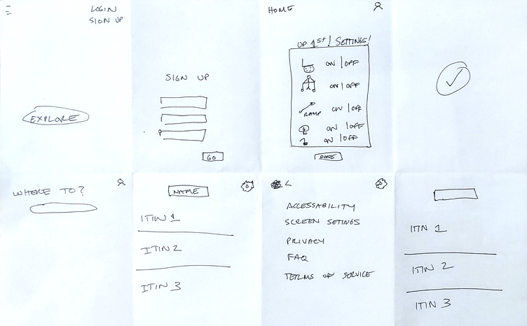
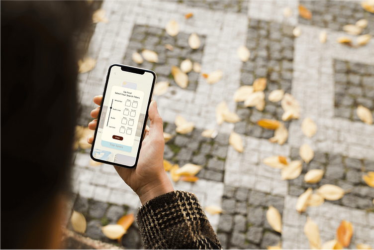
Wireframes
Low Fidelity Wireframes followed my user flows
Methodology: Crazy Eights
Paper Prototyping allowed me to create many iterations without getting overly invested in one idea
After choosing my favorite iterations they were made into paper prototypes and used for another round of user testing
User Testing
Before heading into more complex designs, I created paper prototypes and did another round of user testing.
Aims: To discover any pain points in my current flows
Test Subjects: A new round of potential users, with experience needing accessibility settings
Methodology: Remote screen sharing and video call
This round of testing was extremely useful. Users uncovered valuable insights relating to pain points, areas that could use more depth, and areas that were working well.
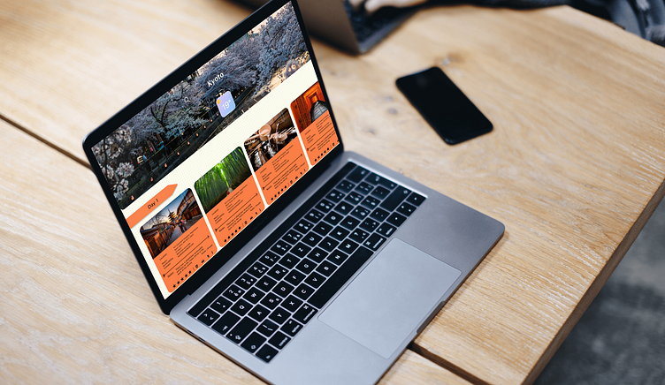
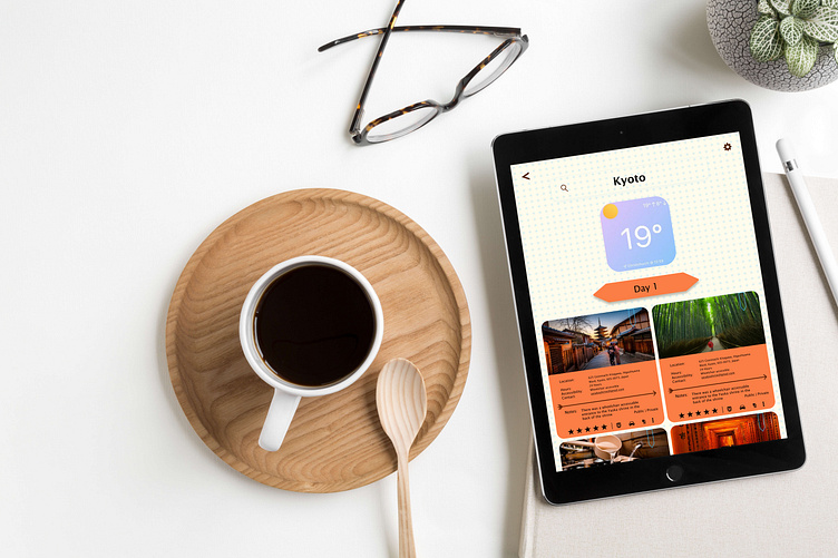
UI Design
After this round of testing, I began working on my responsive designs in Figma.
Visual Style:
Fun, engaging, and inspiring
Incorporating bullet journal stylings
Responsive web app, designed at 4 breakpoints
Designs with accessibility in mind
Appealing to disabled users without a typical sterile feel most accessible designs lean towards
Project Retrospective
This project was a lot of fun to work on. I enjoyed the challenge of creating a fun, interactive travel app while managing robust accessibility features.
One of the largest challenges was making sure to keep as many possible accessibilities catered to as possible. User interviews were invaluable to ensure multiple perspectives were kept in mind.
I went through several iterations to balance a fun, engaging design that also didn't distract users from functionality
I also incorporated fellow designers' feedback regarding the designs, which helped hone various design elements
