Crumb

I was given a basic outline to create a financial app either focused on helping a user save or invest their money. Throughout this project, I created Brand Guidelines, did Competitor Research, did several rounds of user testing, and created designs from sketches to high-fidelity wireframes.
User Journey
With the goal of crafting a robust saving app, I crafted three primary user flows to create a user journey.
As a user, I need to be able to tell the tool what my savings goal is and how long I have to reach it so that I can save accordingly.
As a user, I want to be notified and rewarded when I have reached certain milestones throughout the saving period to know whether I’m on track to reach my goal.
As a user, I want to receive personalized saving plans to save money to reach my goal in time.

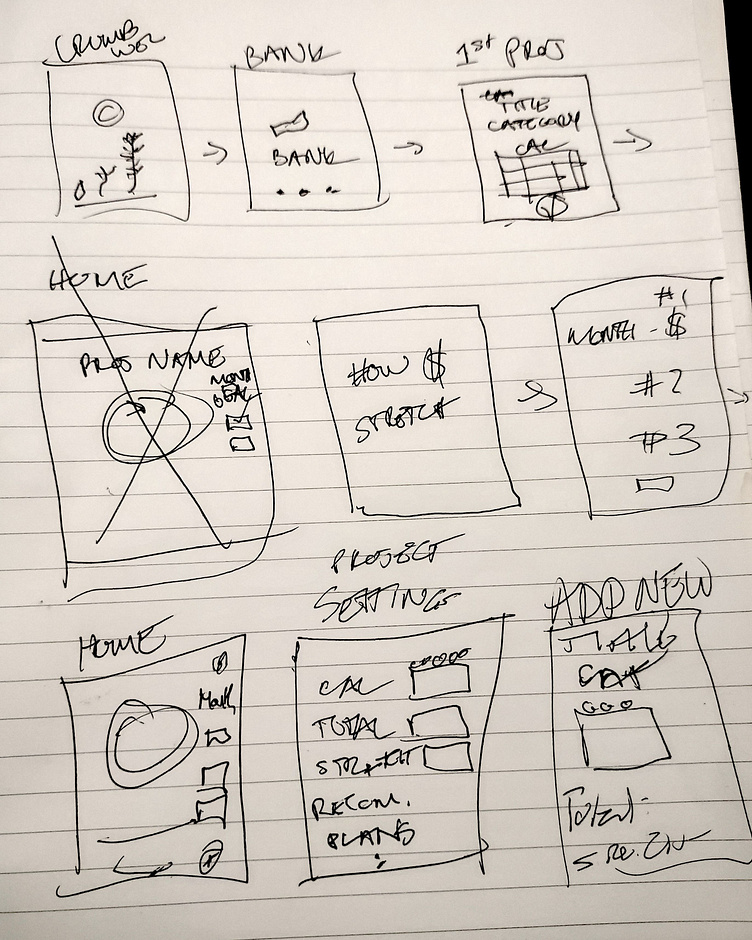
Sketches
After defining my main user journey I set out to create time-saving low low-fidelity sketches of my wireframes. I was able to quickly iterate versions of these wireframes, before choosing what worked the best and heading over to Figma.
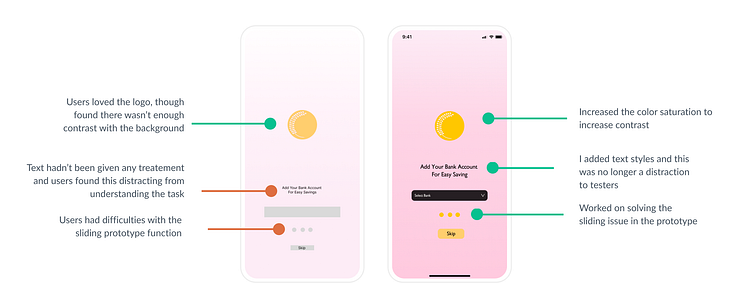
User Testing
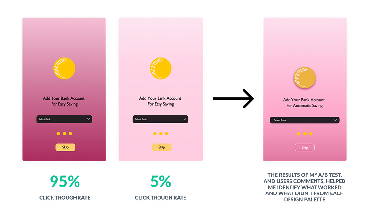
I created a fully functional, high-fidelity prototype of the new flows using Figma. Using the user feedback from my previous testing, I guided my designs to their new level of detail. At this phase, I again incorporated user testing with A and B testing for the color palette of the wireframes. Using the comments on the A and B testing I was able to synthesize those results to create a more welcoming and useable design.
Issue One
I continued to run into issues regarding contrast in my design.
Solution
By creating a design with a darker palette and a lighter one I was able to hear from users what worked for each design, to then create a design that adhered to the Brand Guidelines while also catering to users' needs.
UI Design
Once the usability issues were resolved, I moved on to design the final screens in Figma. My goal was to create a visual identity that was aligned with the brand’s values and message. The key aspects of the Brand Guideline I adhered to were the tenants of clarity, precision, and friendliness. The design needed to be one that is easily understood and minimalist to provide focus. Therefore each wireframe was pared down to its essential details, while still providing robust offerings.