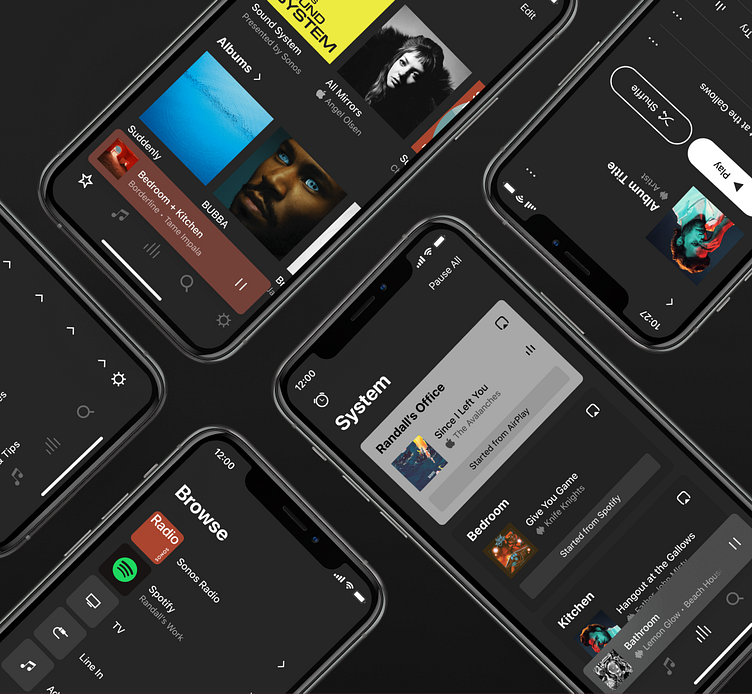
Sonos S2 (Dark Mode)
Circa 2021, dark mode was one of the most requested features from our users. A lot more work goes into it than folks realize - it stress tests your color system and requires a keen awareness of everything that needs to flip, and any new assets you might need as a result of a turn to a darker interface.
Example screens demonstrating the app in Dark Mode.
Split demonstration of app screens comparing the
light and dark mode implementations.
A light peek into the color system, and some of values that we needed to have a dark mode variant accounted for.
These values all get mapped to Semantic Names (ex: textPrimary, playerBackground, cellSelected, etc.) for application into the system.
Thanks for checking it out! Enjoy dark mode in S2 📲🌑🔊
More by 🔊 Randall Parrish 🔊 View profile
Like


