MANA | Energy Drink Concept Design
The "Mana" Energy Drink is a fusion of ancient wisdom and modern energy. Our 500ml can, set against a soft, off-pink backdrop, evokes a sense of tranquility and vitality.
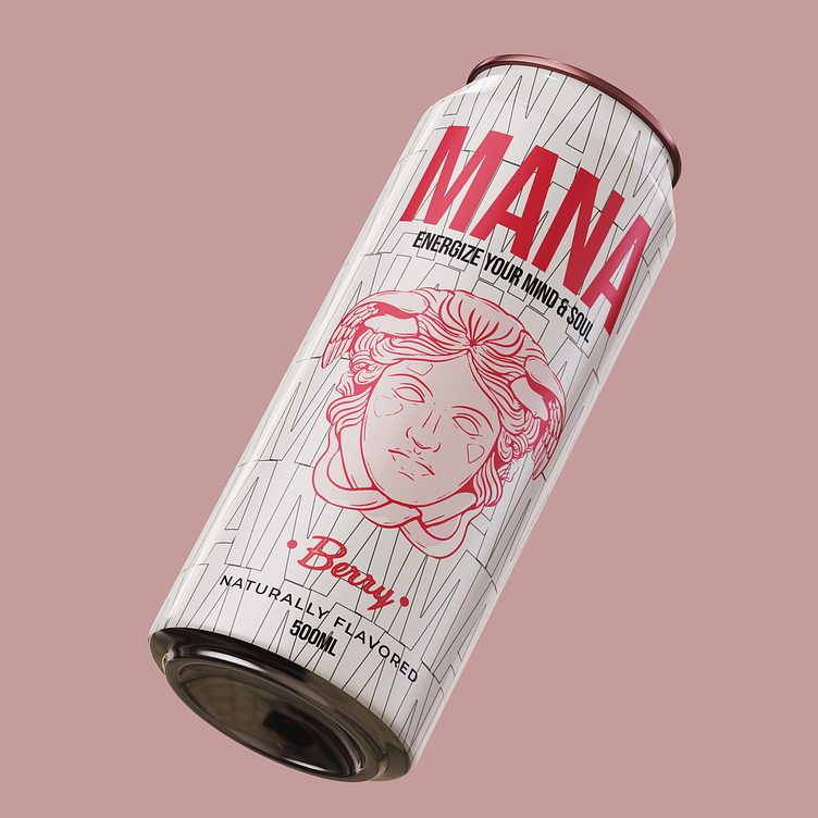
Design Elements:
Typography: The word "MANA" elegantly repeats across the can in hollow lettering, symbolizing the cycle of energy and rejuvenation. The font choice is bold and contemporary, yet hints at a classical influence.
Ancient Greek Bust: Behind the typography-style logo, an image of an ancient Greek bust emerges, linking the past with the present. This fusion signifies the timeless essence of energy that transcends eras.
Color Palette: The shades of red and pink in our design are reminiscent of the berries that infuse our drink with natural flavor, connecting the product to the refreshing taste of nature.
Thought Process: The concept behind "Mana" is to energize not only the body but also the mind and soul. By incorporating classical elements from ancient Greece, we evoke a sense of wisdom and endurance while remaining grounded in modernity. The off-pink background soothes the senses, while the berry-inspired colors tantalize the taste buds.
"Mana" isn't just an energy drink; it's a holistic experience that harmonizes past and present, flavor and vitality. It's a sip of rejuvenation that revitalizes your mind and soul.
