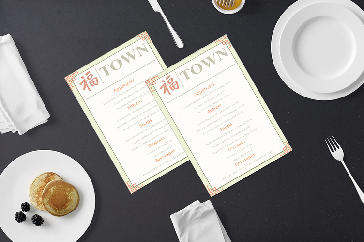
Town Menu
(Mockup: <a href="https://www.freepik.com/free-psd/flyer-mockup-desktop_6624541.htm#page=2&query=menu%20mockup&position=5&from_view=search&track=ais">Image by yeven_popov</a> on Freepik)
(Mockup: <a href="https://www.freepik.com/free-photo/high-angle-woman-holding-menu_34540024.htm#page=3&query=menu%20mockup&position=0&from_view=search&track=ais">Freepik</a>)
Town is a high-end Chinese restaurant that offers authentic Chinese cuisine and hosts events for any occasion. In addition, they have musicians playing classical music while customers enjoy their meals to enhance the fine dining experience they provide. Their target audience is older adults with an interest in elegant dining and lifestyle overall. High society people and no children allowed. The goal for this college project was to design two marketing tools of my choice. The colors fonts, and logo were preselected.
No restaurant is complete without a menu. This one has a minimalistic feel to maintain the elegance of the brand. The background of the menu is white to portray the cleanliness of the restaurant. I also gave it a mint green border because it has a calming effect. It’s also close to white so it adds to the design without taking away from it. I also added a red block design for the corners because this pattern is often used as fences in China, some call them Patter fences. It has a very royal feel. Lastly, for the text, I simply added the food and prices in light gray and the subheadings in orange. I wanted to use gray text in conjunction with the gray logo. Orange is used for the subheading because when combined with colors like gray, it represents confidence. Thank you for reading about my thought process for this design. I would love to create for you! Head over to EdylineBrandDesign.com to fill out my contact form. Let’s flock together!
Enter your text here...


