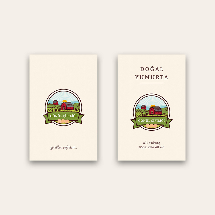
Business Card and Logo Design for Gönül Farm (Gönül Çiftliği)
Logo design and story we prepared for Gönül Farm.
🌲 Green, the predominant color in our logo, evokes a sense of health and tranquility, while blue, another dominant color, gives a sense of trust, peace and cleanliness, and the rising sun gives a sense of hope and sincerity.
🏡 In addition, the hut on the far side of the perspective in our logo symbolizes the stone-oven house that is actually located in Gönül Farm.
🥚 Since Gönül Farm is currently only active in the field of egg production, the silhouettes of chickens and sheep are designed in small sizes with a minimal drawing in our logo and the eggs are emphasized. Thus, a design focused on the right place was obtained without creating message confusion in our logo.
🌉 In the 2nd version of our logo, we used a purple sky instead of blue, emphasizing the feeling of a quality and luxury brand. By incorporating both versions into the brand identity, the brand was given flexibility in terms of the brand philosophy to be conveyed.
☀️ The heart of man; like the soil, it is an infinite giver that gives what is planted, like the sun, it is a light to those who lose their way... This is the main philosophy of our logo design.
📌 "Turn to the service of decency, manners, meaning, love, so that your heart becomes soil, so that knowledge can give life to that soil, and make the seeds of faith and love in your bosom flourish." - Özkan Günal
Copyright © 2023 All Rights Reserved. | designed by egemen erol & merve erol
®️ You can contact me via e-mail or whatsapp for all your corporate identity and brand design projects such as logo design, web design, printed product designs.
You can make a video or audio call appointment to discuss the details.
