Logo Design for Insurance Company AYKA
Logo design and story we prepared for Ayka Insurance.
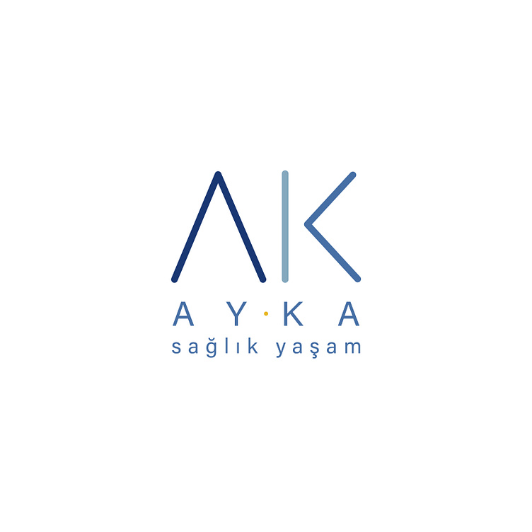
📌 In our design for AYKA Insurance, the authorized agency of Allianz Insurance; While referring to the logo of Allianz, which emphasizes the sense of trust and resembles 3 columns side by side, we used the initials A and K, which are the abbreviation of Aysel Kaya, by applying a flat design.
🫡 Thus, instead of directly using the usual figures of insurance agencies; We have created a symbol that is a signature, completely unique to the company and where the sense of trust is at the forefront.
🔵 By using a dot between A and K, we aimed to draw attention to the fact that the word AYKA is an abbreviation and to emphasize the sense of trust that the dot evokes in us once again in our design.
☀️ In the use of our logo with name and slogan; By lowering the dot between A and K between AY and KA syllables, we have achieved the balance of typography-drawing in the design.
🏠 Finally; In the use of our logo design with the slogan "health-life", we ensured that the logo is in a triangular form like a roof when viewed from the whole.
🏡 In addition, the letter A in the logo also evokes a roof and a house, emphasizing the feelings of "trust, inclusiveness and protection", which is the company philosophy of AYKA Sigorta.
Copyright © 2023 All Rights Reserved. | designed by egemen erol & merve erol
®️ You can contact me via e-mail or whatsapp for all your corporate identity and brand design projects such as logo design, web design, printed product designs.
You can make a video or audio call appointment to discuss the details.
