Open-source Blockchain Development Platform Branding WIP
Branding guidelines and corporate identity:
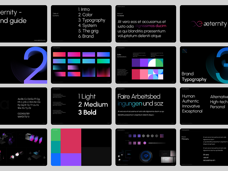
The use of the color pink in the brand's previous color scheme represents a fresh, modern, and innovative approach to technology. The refreshed color scheme builds upon this association and reinforces æternity's commitment to progress and change.The choice of PLEX SANS and IPLEX MONO as the brand's font conveys a sense of reliability and stability. The clean, sans-serif design is easy to read and provides a clear, uncluttered look. The use of a popular open-source font emphasizes Aeternity's commitment to transparency and accessibility.
Our Brand Guidelines for aeternity include logos, icons, and other graphical elements that are used consistently across all touchpoints, including the website, marketing materials, and social media. The visual identity should be easily recognizable and memorable, creating a strong connection between the brand and its audience.
Services we provided:
— Product Design
— UX/UI Design
— Market Research
— Design System
— Visual identity
Look forward to getting your feedback, friends.
Finwerk.com |Medium | Linkedin
Start working with us.
We would love to hear about your idea.
Email us at hello@finwerk.com
