Doctor marketing landing page
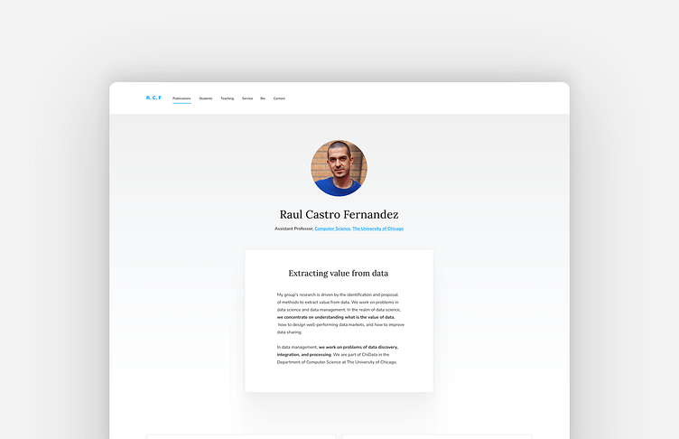
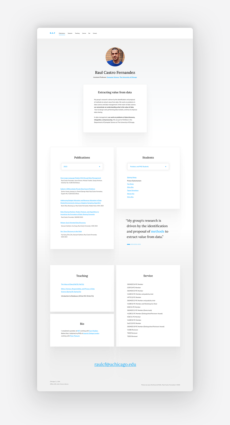
Everything is based off the 8pt grid. The client mentioned not having to scroll, so I made the publications and students section have a drop down. This consolidates the information into these sections instead of having it scroll down to see each year. The sections are also next to each other saving more vertical space. I added a little quote section - thought it might show a little more personality or info to the design. Then finally at the bottom I have the teaching, service and Bio. Below that the email for easily contacting the client. The colors are very subtle, a light gray that fades to white at the top and bottom of the page. Used a similar blue, dark enough for good contrast. This blue is used for all the links for consistency.