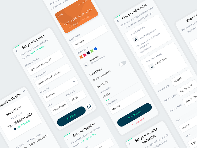
Mobile banking app case study WIP
Building a Secure and User-Friendly Payment Experience
The Paylit platform is a solution that is built to help you spend, send, and save smarter. Welcome to your new favorite way to do all things money.
How we helped
Finwerk assisted Paylit in creating a modern digital wallet interface and branding that would reflect their brand values and objectives. We worked closely with Paylit to build a digital wallet that was both user-friendly and secure, ensuring that customers' financial information was protected while they made payments.
We built the digital wallet we always dreamed of having - simple, secure, and innovative
Branding guidelines and corporate Identity
The color scheme chosen for Paylit branding is dominated by a green-cyan, dark blue, and orange for contrast. The green-cyan symbolizes growth, stability, and reliability, while the dark blue represents professionalism and trust. The orange contrast highlights the innovative and modern aspect of the brand. The overall color scheme and the brand's visual identity were developed to reflect the brand's values of simplicity, security, and innovation.
Services we provided:
— UX/UI Design
— Market Research
— Design System
— Visual identity
Look forward to getting your feedback, friends.
Finwerk.com |Medium | Linkedin
Start working with us.
We would love to hear about your idea.
Email us at hello@finwerk.com


