Brand Identity for Cécile Zimmerli

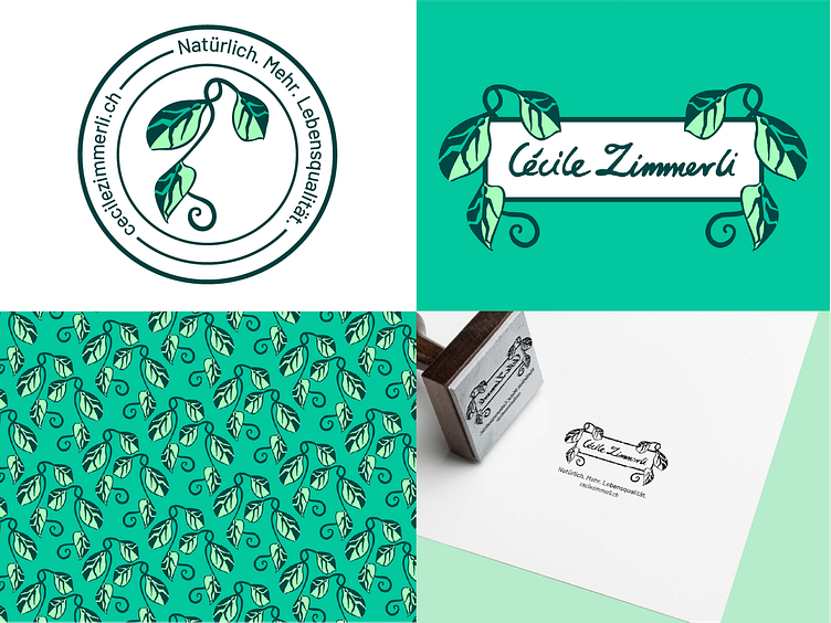
The brand should symbolise natural health. Sending a positive, hopeful, and trustworthy message to people looking for a natural way of managing chronic illness. During the research phase I looked for inspiration from medicinal history, and came across ancient apothecary jars. I found a number of colourful, patterned, geometric, dynamic designs, showing plans and people. I wanted the symbol to contain the human body. The characters in the leaves emphasise vitality and activity, the desired outcomes for her clients/ using her products and services. The shading of the leaves create a yin and yang image for each person, alluding to the balance her clients strive for.