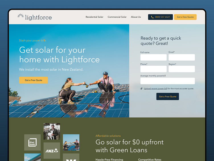
Lightforce Website
Designed for Conversion
With a goal to quickly summarise the key value offered and establish trust, the rest of the landing page works to educate and convert, while making enquiry as simple as possible. We focused on simple scannable brand language while avoiding jargon, mentions of price, or any aggressive sales tactics.
Ultimately teasing price and building intrigue were the most important factors for conversion, giving a reason for people to get in touch, rather than assuming they have enough information to make a decision without the sales team.
800%
Increase in qualified leads directly attributed to our ads.
425%
Increase in website conversion across web & landing pages.
Visit our websiteㅤ|ㅤView case studyㅤ|ㅤContact us

