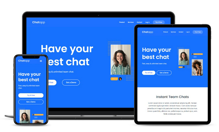
Build ChatApp website with Webflow
Responsive Web Design on any devices with Webflow
Luckily with Webflow, we can use the power of responsive design, and serve our users different layouts and very specific responsive layouts for their specific fonts and specific devices that they are looking at.
Breakpoints, or Media queries, for displaying our design including:
Desktop View
Tablet View
Mobile Landscape View
Mobile Portrait View
View more on my website:
Use this project for your own
If you want HTML CSS codes for desktop view mode, download them from the below link on GitHub:
Chat App website Video:
More Videos on YouTube: > > Nansiya YouTube Channel
Chat App website desktop view:
Chat App website tablet & mobile view In 2 slides:
More by Nasrin S. View profile
Like


