Finizzi Case Study
Project Outline
The client was trying to create a new logo and brand guide for his new startup venture. His startup idea was in the fintech industry to provide a budget tracker/personal finance app for Individuals and SMEs.
From the beginning of the project, the client pursued the logo to have the look of a Chart as that would be the first look of their app. The chart would track everything about the end users' personal finances. Meanwhile, the client also planned that the app could link many promos for the users.
Moodboard
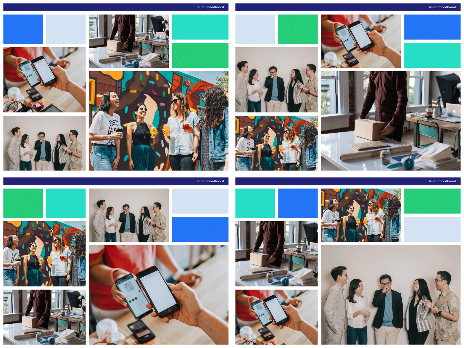
Before starting the project, I tried to create a moodboard containing images reflecting the brand vibe and colors that were probably going to be used. From the beginning, the client wanted the brand to be blue and green.
This moodboard confirmed that the nuance of the images and the specific blue and green fit the client's vision of how the Finizzi should look.
I was able to start with the explorations work with my playgrounds by using the moodboard as the guide afterward.
Explorations and Playgrounds
The most remarkable logos are born from a realm of explorations and playgrounds. Creativity thrives when it has the freedom to explore uncharted territories, free from the constraints of fear. This philosophy has always been the guiding force behind all my projects, enabling me, as a designer, to push the boundaries of creativity.
The glimpses shared below represent just a fraction of the countless sketches and unused vector graphics that were part of the genuine creative journey. In reality, this exploration process is often chaotic and unpredictable. However, it is within this playful chaos that the seeds of brilliant logo concepts are sown and nurtured.
Logo Options
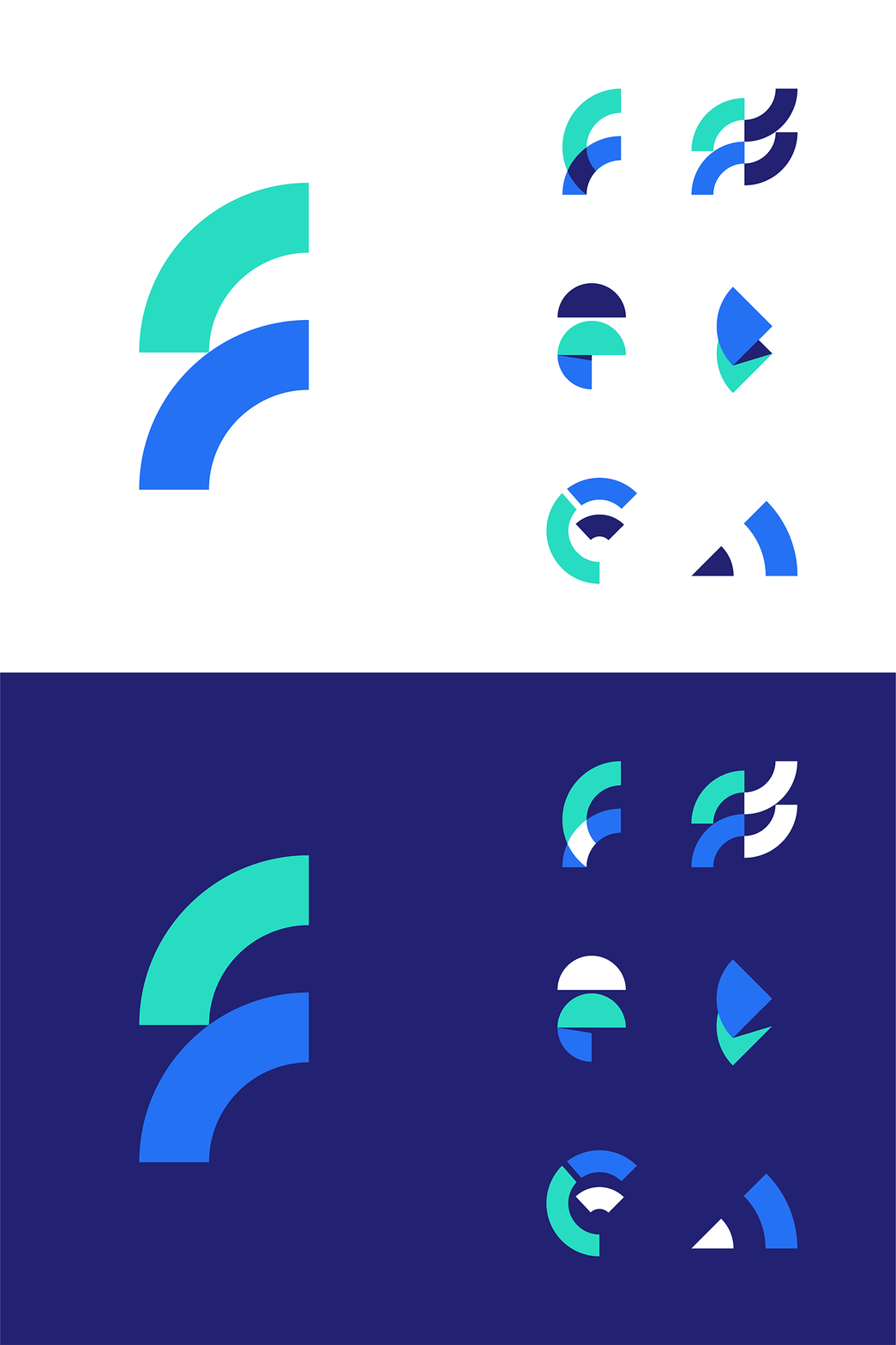
The gallery below shows the first draft covering 3 Logo Concepts. From the beginning, the client already felt that Concept 03 would be the best one to be finalized. However, the client wanted to make sure by having more options and explorations.
That is why in the second draft, I came up with more options and added Concept 03 modified. The gallery below shows the second draft. The client eventually agreed that Concept 3 from the 1st draft to be finalized as the Finizzi logomark.
Final Logo
----------------------------------------------------------------------------------------------------
Brand Applications
----------------------------------------------------------------------------------------------------
Login Screen App
Mobile App Screen
Stationery
Apparels
Payment Device and Cards
Social Media
Outdoor Signage, Posters, and Billboards
End of Presentation
Thank you for watching this case study. This is based on a real project (a Logo and Brand Work). So, all concept designs belong to Finizzi as the client. I would like to hear from you guys, all designers about the things I might be able to improve for the next project I have.
---
Finizzi is a fintech company having innovation in technology to help a lot of people to manage their financial expense and income easily also get access to many promos.
---
Always available for freelance work.
Please contact me at ardiannf.nideli@gmail.com or use the "Hire Me" button on my profile to work with me.
---
Follow my Instagram ardiannfauzi


