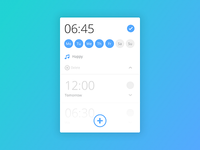
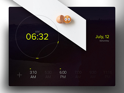
Day 013 - Alarm Clock
Went for a classic layout, maybe with a bit of extra time and mind space I'd think a different way to explore this UI. Again, I did this one using most of the existing UI elements from previous shots.
Comments are welcome as long as they are constructive.
And that's it, see you tomorrow.
PS: All shots are going to be done in Sketch so I explore the awesome features this tool offers for UI design.
More by Carlos Sousa View profile
Like


