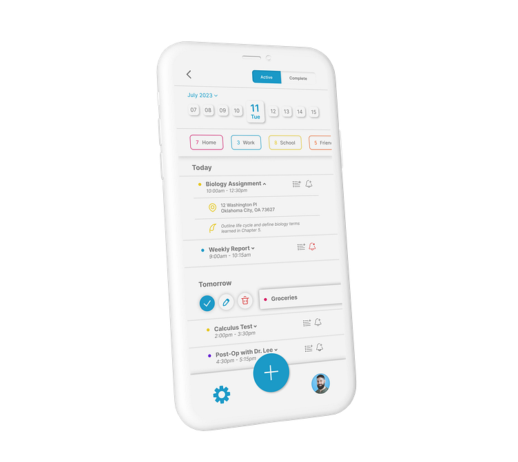
Checklist App - Main Screen
The Challenge
This Dribbble Weekly Warmup challenge was to design the main screen of a checklist app. We had to think about how users add items to their list, check off completed items, and see recently completed items.
Research and Planning
I started by reading articles and reviews on other checklist apps out there and browsed Dribbble to find high quality inspiration for my app. I then compiled a list of features I thought were needed for the user to manage their to-do list as seamlessly as possible.
Wireframing
Next, I laid out the structure of the main screen by sketching a quick low-fidelity wireframe that included a visual draft of what the features might look like and where they would appear on the screen.
I then moved to Figma and digitized my wireframe, helping to concretize my ideas and providing a blueprint for the final design.
Final Design
I added fun colors, brightening the often cumbersome idea of tackling one's to-do list, while still maintaining a clean design so as not to overwhelm the user and ensure their tasks remain clear, readable and easily manageable.


